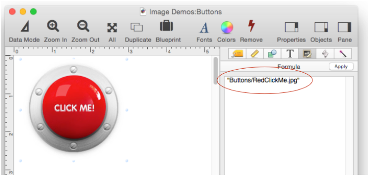
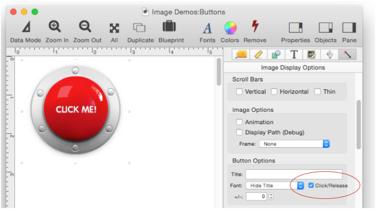
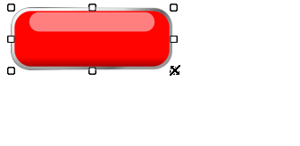
Any Image Display Object can be a push button. All you have to do is take a regular Image Display Object and add code (see Form Object Code). In this example, the image is a JPEG file named RedClickMe.jpg.
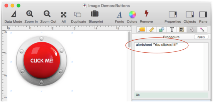
The code is immediately triggered when the image is clicked.
If you want to make a button that looks like it is actually being depressed when you push on it, you have to create two images. The second image should look like it is being pushed. It must have the same name as the primary button image, but with .DOWN at the end (but before the extension).
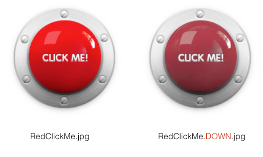
The Image Display Object formula must have the name of the primary button image (without the .DOWN).
Panorama won’t display the .DOWN image unless you enable the Click/Release option.
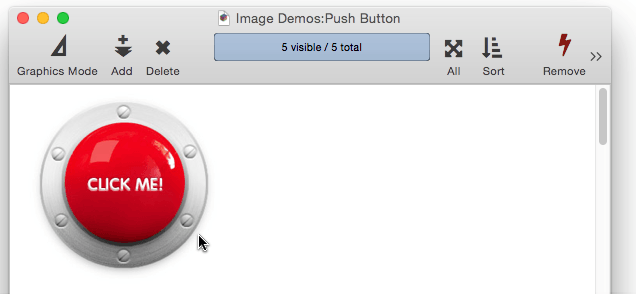
Once all these steps are complete, you now have a custom push button with custom highlighting when you push on it. The associated code isn’t triggered immediately, instead it isn’t triggered until you release the mouse over the button. Here’s the finished button in action.
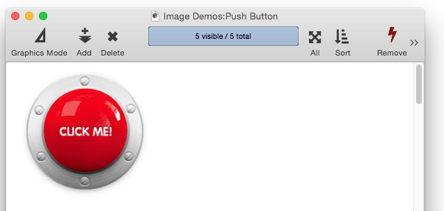
Creating a double button image like this is more work, but the result is a more realistic looking button.
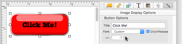
Custom Push Button Title
In the previous example the button title was baked into the image, created with Photoshop, Pixelmator, etc. But you may want to use a blank image and add the title in Panorama. To do this you need to type in the title in the Button Options area. You also need to change the Font from Hide to some other option.
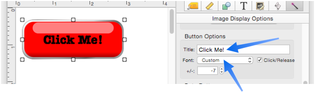
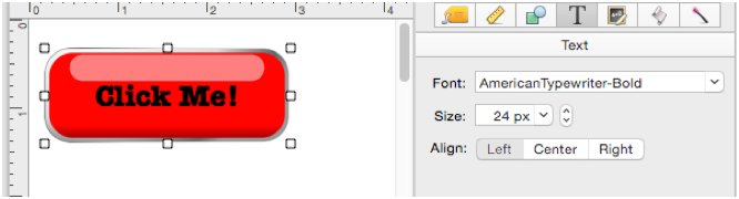
In this example the Font is set to Custom. When the Custom option is used, the actual font and size are chosen with the Text Options panel.
When a button title is specified, it will always be centered horizontally. Panorama will also attempt to center the text vertically within the button. Depending on the font used, the vertical position may need to be adjusted, which can be done with the +/- option.
Nine Part Image Scaling
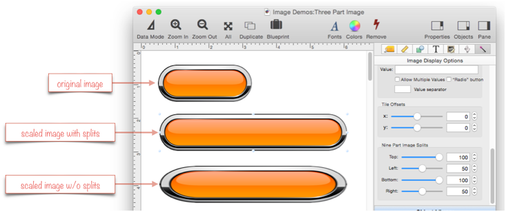
Images that look like buttons often don’t scale very well, as shown in this example.
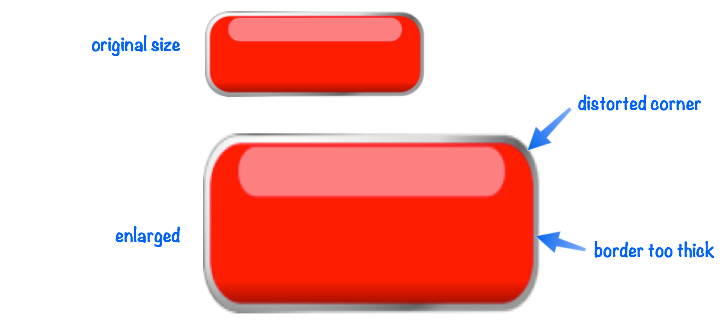
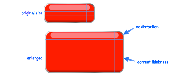
This problem can be fixed with something called nine part image scaling, which divides the image up into 9 parts. The corners stay the same size as the object grows, the center grows both horizontally and vertically, while the edges grow in one dimension only.
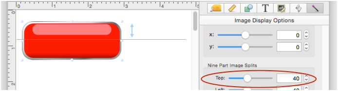
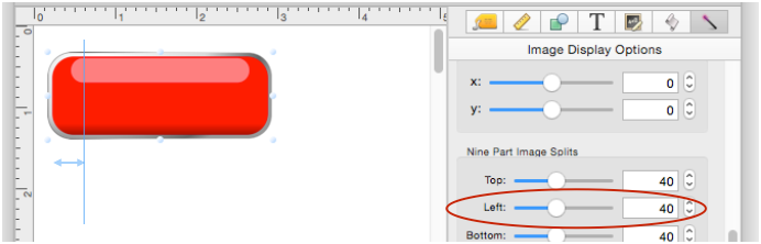
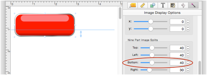
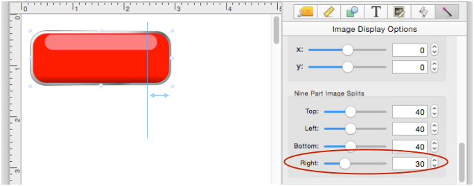
There are 4 dimensions for splitting the image into 9 parts:
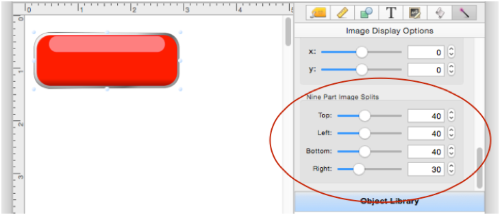
Distance from top:
from left:
from bottom:
and from right:
Once you have adjusted the splits properly you can expand the image without distorting it.
Some images can’t be expanded vertically without distortion, but you can still set up splits so that the object can be expanded horizontally.
The Nine Part Image Scaling option is described on this page because it is most commonly used for custom push buttons, but it can be used for any Image Display Object, whether it is a button or not.
See Also
- Font Awesome Icons --
- Image Display Data Buttons --
- Push Button Object --
- Image Display Object -- is used for dynamic images (images that change depending on the data).
History
| Version | Status | Notes |
| 10.0 | New | New in this version. |