This page explains how to customize the appearance of a Tab Panel Object.
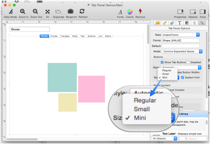
Button Size
Tab panel button sizes can be set to one of three sizes: Regular, Small or Mini. This example shows the smallest size, Mini.
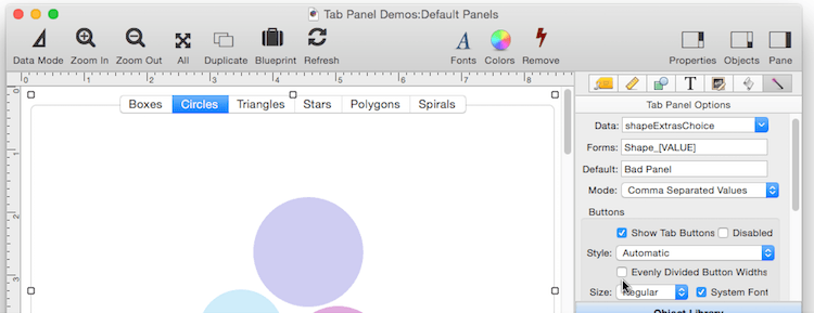
Normally the buttons are displayed using the standard computer system font. You can uncheck the System Font option and pick a different font using the font panel, but the results are generally disappointing – we recommend sticking with the system font.
Button Width
Normally the buttons are centered and “smushed” to the minimum width to fit each button title. If you check the Evenly Divided Button Widths option, the buttons will spread out to fill the entire panel, and the buttons will all be the same width.
No Buttons
Uncheck the Show Tab Buttons option to turn the buttons off completely.
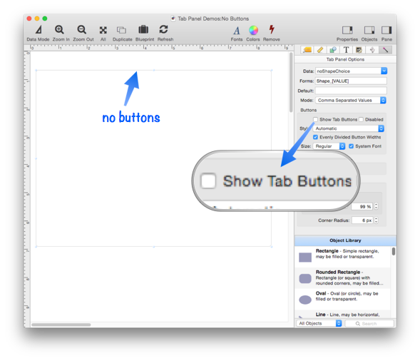
Why would you want to do that? Well, you could change the panels with a program, or you could use a pop-up menu, text list or matrix to select the panels. This example form has two objects – a Tab Panel Object with no buttons, and a Text List Object.
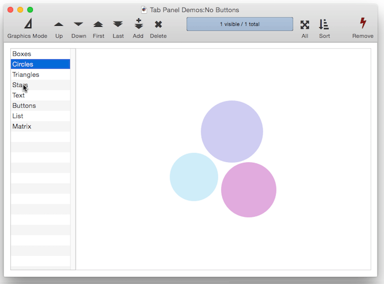
There’s no programming needed to make this work. All you have to do is set up the Text List Object with a formula that specifies the list of panels in the Tab Panel Object, and also set it up so that the Text List and Tab Panel objects use the same Data variable.
Border
Panorama normally displays a border around the panel. The corners of the border are rounded. You can make the radius of the border larger or smaller.
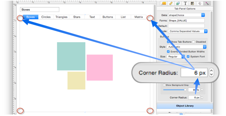
If the radius to is set zero, the border will have sharp, square 90° corners.
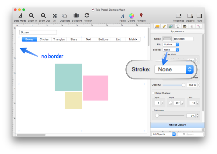
If you don’t want any borders at all, go to the Appearance panel and set the Stroke to None.
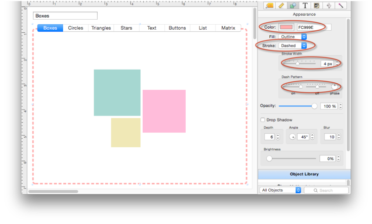
You can also customize the color, border stroke width and use a custom dash pattern.
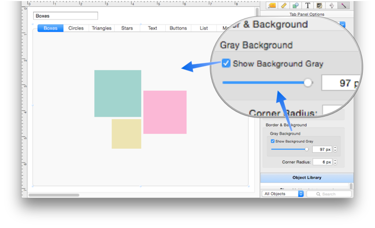
Background
The tab panel background is usually empty, but if you enable the Show Background Gray option you’ll get a nice gray background. You can adjust this from 0 (solid black) to 100 (pure white).
See Also
- Tab Panel Buttons and Selection -- button options for a Tab Panel Object.
- Tab Panel Constructor -- quickly creating a Tab Panel Object from a template.
- Tab Panel Content -- setting up the content for a Tab Panel Object.
- Tab Panel Forms -- setting up the forms for a Tab Panel Object.
- Tab Panel Object -- switchable tab panels.
History
| Version | Status | Notes |
| 10.0 | New | New in this version. |