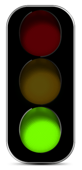
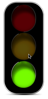
Any Image Display Object can be a custom checkbox or radio button (see Data Button Object). Here is an example which works just like a checkbox, but looks like a traffic light. Each time the image is clicked it toggles on or off.
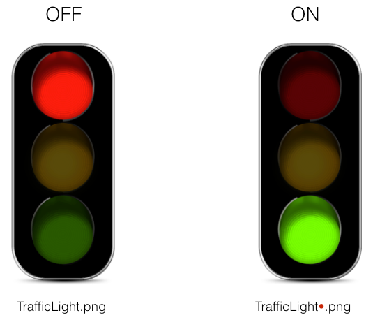
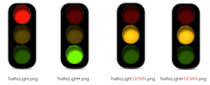
To create a data button you need to have two images – one for the OFF state of the button, and one for the ON state of the button. The two images must have the same name but the ON image must have • at the end of the name (but before the file type extension). Use Option–8 to type the • symbol.
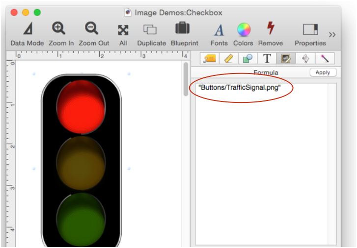
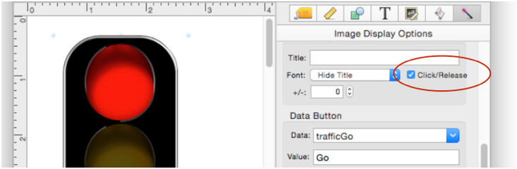
Set the Image Display Object formula to display the OFF image, like this.
To make this into a data button you must specify the field or variable in the Data item, and the on value in the Value item. In this example the trafficGo variable will toggle between blank when off (red), and Go when on (green).
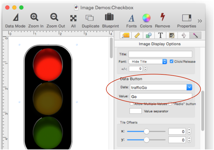
Once these options are set up the checkbox is now ready to use. When you click on the light it will toggle between red and green. As it toggles, the trafficGo variable will also toggle between "Go" and "".
Click/Release
If you want, you can make a fancier data button with four images. The two extra images will be displayed when the mouse is pressed down.
After creating these extra images, make sure you check the Click/Release option.
When you press on the button, the .DOWN image will appear. The button will not toggle until you release the mouse over the button. If you slide the mouse off the button, it will not toggle.
In this example both .DOWN images are the same (a yellow light), but usually they would be different.
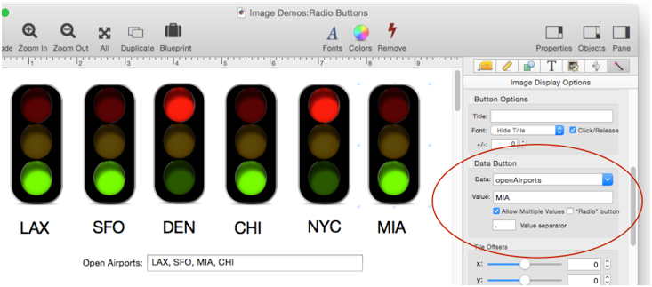
Radio Buttons
You can also use Image Display Objects as radio buttons – in this case as radio buttons with multiple values allowed.
The options for setting up Image Display objects as radio buttons are exactly the same as regular radio buttons, so I won’t repeat the details here. See Data Button Objects for the details.
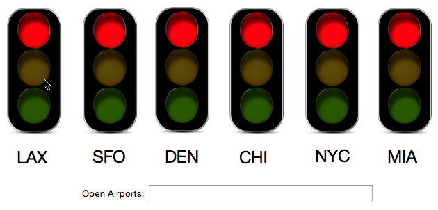
Radio Button Titles
In the previous example the buttons had titles, but these were actually separate label objects positioned below each object. With some limitations, it’s also possible for the Image Display button to draw its own titles, as seen below.
The title can only appear to the right of the image itself. If you display a title, the image must be displayed in the upper left hand corner – it cannot be scaled. In other words, it must be displayed actual size.
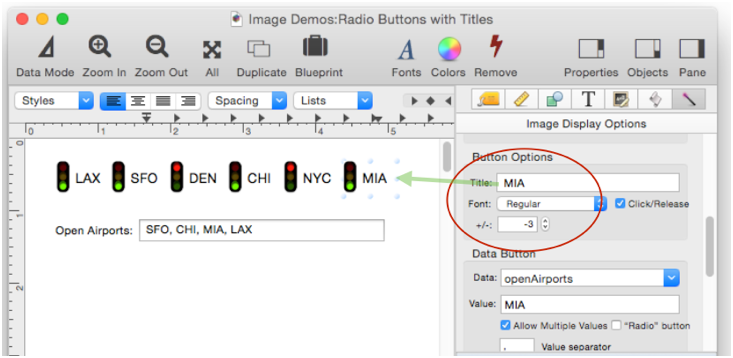
The title can be displayed in a regular, small or mini system font, or you can use a custom font. The +/- parameter allows you to shift the title up or down to match the artwork.
See Also
- Data Button Object -- is used to create checkboxes and radio buttons.
- Font Awesome Icons -- are over 600 ready-made icons built right into Panorama.
- Image Display Object -- is used for dynamic images (images that change depending on the data).
- Image Display Push Buttons -- push buttons created from custom images.
History
| Version | Status | Notes |
| 10.0 | New | New in this version. |