Data Buttons Objects are buttons that have a value associated with them. The value may be stored in a database field or in a variable. An on/off data button is usually called a checkbox.

Data buttons may be grouped together as radio buttons. Only one button in the radio button group may be selected at a time.
Panorama also allows you to build a group of checkbox buttons where more than one member of the group can be selected at a time.
See Multiple Value Button Groups below to learn more about this option.
Creating a Checkbox Button
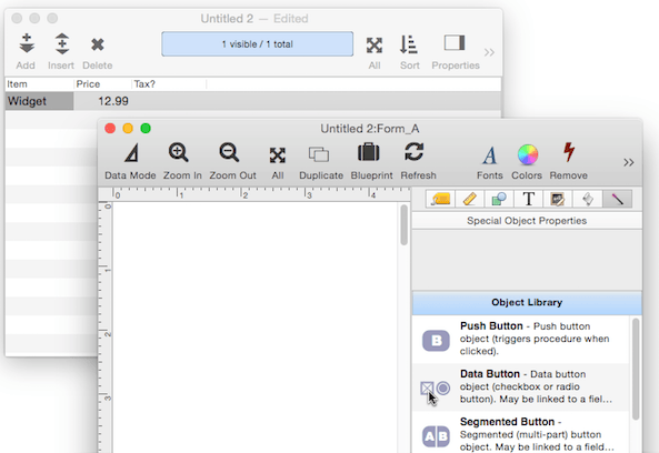
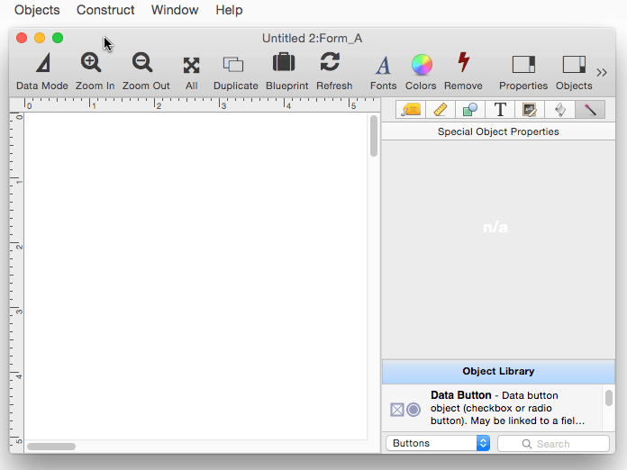
Creating a checkbox button is a three or four step process. Start by dragging a checkbox from the Object Library onto the form. (I’m also showing the Data Sheet because I’m going to link the checkbox to an existing field in the sheet.)
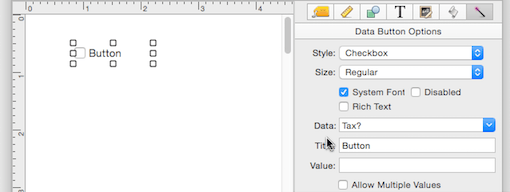
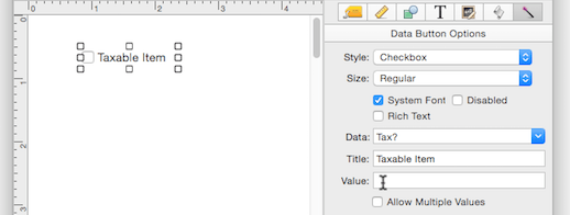
Next, specify the field or variable that will contain the value associated with the checkbox. You can type in the name, or select a field from the pop-up menu. In this case, I’ll link the checkbox to the Tax? field.
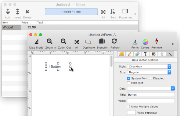
Next, type in the title of the checkbox.
Finally, enter the value that will be placed in the field or variable when the box is checked. If the value is left empty, the title will be used as the value. For this example, I’ll set the value to YES.
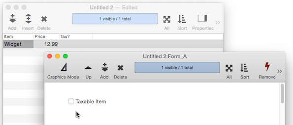
Switch the form to Data Mode and the checkbox is ready to use. As the checkbox is clicked, the Tax? field toggles between empty and YES (watch the data sheet in the background).
Creating a Group of Radio Buttons
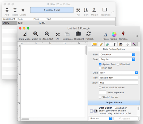
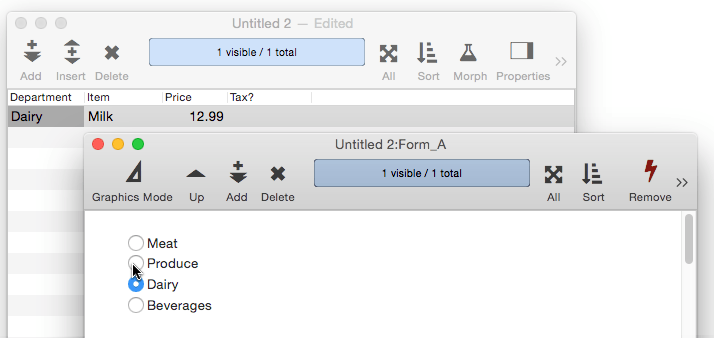
A group of radio buttons is created by creating one button, then making copies. The first radio button is set up almost the same way a checkbox is created – create the object, assign the field or variable, and the title. The one difference is that the style must be changed from Checkbox to Radio Button, as shown here.
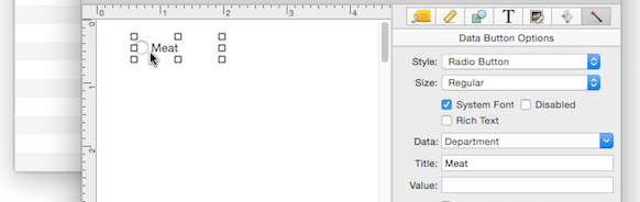
Once the first button is complete you simply have to make copies of it with different titles. You can make copies by holding down the Option key while dragging (as shown below), or by using Copy/Paste.
Switch the form to Data Mode and the radio buttons are ready to use. As each button is clicked, the Department field is updated (watch the data sheet in the background).
If there are a lot of options, creating the radio buttons manually can be time consuming. Fortunately, you can use the Constructor menu to automate the process. The Constructor takes care of everything in seconds. In this example the Constructor is used to lay out an entire form, including a radio button group. All you have to do is type in the values for the group.
To learn more about this dialog, see Radio Buttons in Automatic Form Construction.
Creating a Group of Checkboxes
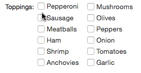
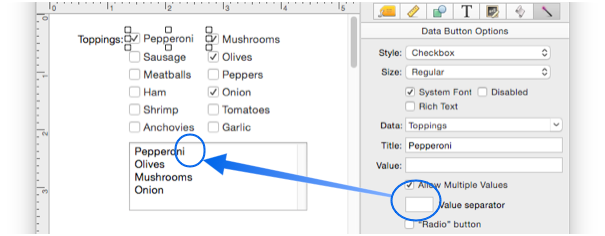
If you want to be able to select more than one value, create a group of checkboxes instead of a group of radio buttons. The technique for creating these is the same as described above for creating a group of radio buttons, but you must make sure to check the Allow Multiple Values option, as shown below.
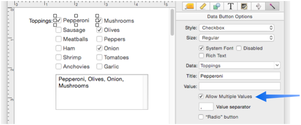
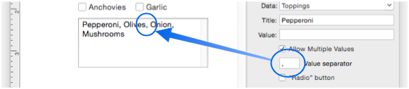
You can also specify a Value Separator that will be used between the values. In this example, the separator has been set to a comma+space (you can’t see the space, but it is there). (Note: The topping list is being displayed in a separate Text Display Object so that you can see the value of the Toppings variable. You’ll have to create this Text Display Object separately if you want it.)
If you leave the Value Separator empty, a carriage return will be placed between each value.
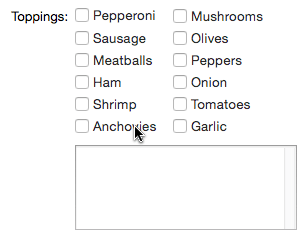
Here’s what a group of checkboxes looks like in action.
Data Button Options
The magic panel for data button objects contains about a half-dozen options.
Style – There are three styles available: checkbox, radio button and sticky push button.

You may not be familiar with the sticky push button style. This style looks like a push button but works like a checkbox – each time you click it, it toggles on and off.

Size – Data buttons may be one of three fixed heights: Regular, Small or Mini.
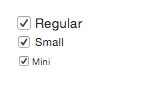
These are the only sizes available – see Cocoa Objects for more detail about the reasons for this limitation.
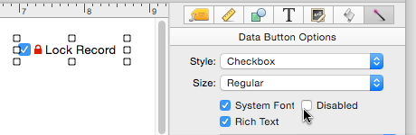
System Font – If this option is checked the button title will always be displayed using the standard system font and font size. Uncheck this option if you want to use a non-standard font or size (in which case you select the font and size from the Text panel, see Fonts).
Rich Text – If this option is checked the button title can include rich text tags for different styles, fonts, colors – even icons.
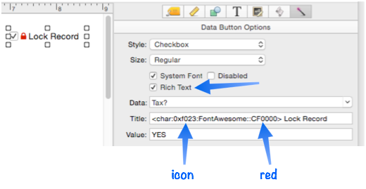
See Rich Text for the details on available style options, and Font Awesome Icons for more information about using icons.
Disabled – This option disables the button. When the button is disabled it is dimmed and it can’t be clicked on.
Of course there is no point in a button that is permanently disabled. So normally you would enable/disable a button with a procedure. See Push Button Objects for an explanation of how a procedure can enable/disable a button.
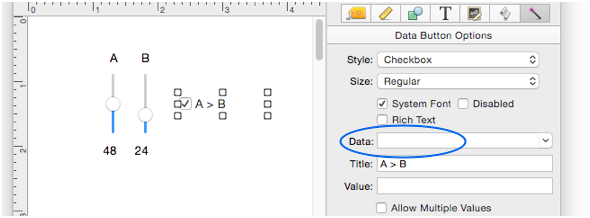
Data – This option specifies the data that is to be edited. You can either type in the name of a field or variable, or you can choose a field name from the pop-up menu (on the right). Panorama will also auto-complete field names as you type.
Note: If you specify a variable that has not already been created with a procedure, Panorama will automatically create a global, fileglobal or windowglobal variable with this name the first time the form is displayed. The type of variable created depends on the Form Preferences.
If the Data option is left blank, the button will operate in Formula Mode. See the discussion of this mode at the bottom of the page.
Title – This is the title that appears on the button. If the Rich Text option is checked, the title can include Rich Text tags.
Value – This option specifies the data value corresponding to this button. Each button can have a single value, which you should type into the box next to the word Value. If you leave this box empty, Panorama will use the Title for the data value, so it’s only necessary to explicitly set the value if you want it to be different than the title. (For example you might want the title to be California but the value to be CA.)
Allow Multiple Values – It’s possible to group together multiple buttons associated with the same field or variable. Normally clicking any button in the group erases the current value and replaces it with the new value (normal radio button behavior). However, if you have the Allow Multiple Values option turned on, clicking on the button will add the new value to the existing data in the field or variable, with the Value Separator (see below) in between.
As an example of the Allow Multiple Values option, consider pizza toppings. A pizza may have one, two, three or more toppings, or even none at all. Using the Allow Multiple Values option, you can create a series of checkboxes that will generate a list of toppings in a single field or variable. As the user clicks on each topping, it will be added to the end of the list. To remove a topping from the list, click on it again.
Value Separator – This is the text that will appear between each value in a multiple value list. Common separators include commas, spaces, slashes and hyphens. The separator may be a multi-character separator like comma+a space.
If the separator is left blank then carriage return will be used as the separator.
Radio Button – The data button normally toggles the value on and off each time you click on it. Turning on the Radio button option prevents the button from toggling off. In other words, you can turn the button on, but you can’t turn it off again. Usually this option is only used for radio button combinations, where the value will be automatically turned off by clicking on another button in the group. This option prevents the user from turning off all the buttons in the group, so there is always at least one radio button checked.
Formula Mode
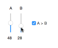
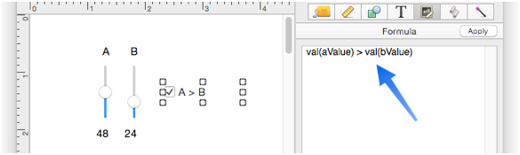
If the Data option is left blank, the button will operate in Formula Mode. In this mode, the button displays the result of a formula instead of being linked to a field or variable. This simple form illustrates how this mode works. When the value of A is greater than the value of B, the button is checked. The button isn’t being clicked on, it is simply reacting to the changing values.
The Data option for this checkbox is empty.
So the checkbox is linked to the formula instead of to a field or variable. This formula will return true if the A value is larger than the B value. The box will be checked when the formula is true.
Since the checkbox is not linked to a field or variable, by default nothing will happen when the checkbox is clicked. Panorama doesn’t know what to do since there is no field or variable to change. However, Panorama does trigger the code that belongs to this checkbox, so that code can do something appropriate. In this example, the code is designed to shift the A value above or below the B value.
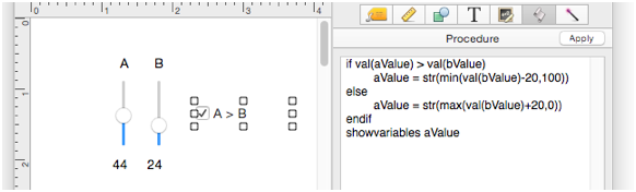
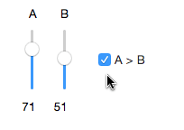
Here is what actually happens when the checkbox is clicked.
Of course you can program the checkbox to do whatever is appropriate for your application.
See Also
- Adjusting Object Spacing -- adjust the spacing between multiple selected objects so that the same amount of space is in between each pair of objects.
- adjustobjectspacing -- adjusts the spacing of selected objects in a form.
- adjustobjectspacingdialog -- opens a dialog sheet to adjust the spacing of the currently selected objects.
- Aligning Objects -- so that two or more object edges are made even with each other.
- Automatic Form Construction -- creates a column of form elements for editing data fields (or variables).
- Automatic Mailing Label Construction -- creates a mailing label.
- Automatic Report Construction -- creates a tabular report with columns of data.
- Cocoa Objects -- discussion of how objects are implemented in Panorama X compared to earlier versions
- Creating a New Form Object -- with the Object Library.
- Diagnosing a Formula embedded in a Form Object -- diagnosing problems with formulas embedded in form objects.
- Displaying Data in a Grid -- fundamentals of displaying data in a grid (Text List/Matrix).
- Duplicating Objects -- to make copies of one or more objects.
- Fixed Image Object -- is used for fixed images (images that never change).
- Fonts -- setting the font and text size of form text objects.
- Form Object Appearance -- changing the color, fill, stroke, opacity and drop shadow attributes of selected objects.
- Form Object Blueprint -- display and edit raw object specifications
- Form Object Code -- associating programming code with an object
- Grouping Objects -- allows you to manipulate multiple objects as if they were a single object.
- Image Display Animations -- animated images.
- Image Display Colors and Gradients -- displaying pure colors and gradients
- Image Display Data Buttons -- checkboxes and radio buttons created from custom images.
- Image Display Object -- is used for dynamic images (images that change depending on the data).
- Image Display Push Buttons -- push buttons created from custom images.
- info("clickedobjectname") -- returns the name of the button that was just clicked.
- Line Item Grid Constructor -- creates a grid of form elements for displaying and editing line item fields.
- Line Object -- draws a line within a form.
- Matrix Clicking -- handling clicks in a Matrix Object.
- Matrix Constructor -- quickly creating a Matrix Object from a template.
- Matrix Database Integration -- synchronizing a Matrix Object with a database.
- Matrix Geometry -- customizing the size and geometry of Matrix Object elements.
- Matrix Header and Horizontal Scrolling -- setting up a custom header for a Matrix Object grid.
- Matrix Object -- displaying a grid of items with a custom arrangement.
- Matrix Object Frame -- setting up the arrangement of items within a Matrix Object.
- Matrix Programming -- programming a Matrix object.
- Object Inspector Panel -- is used to view and modify the attributes of selected objects in a form.
- Object Library -- is used to create new objects in a form.
- Object Names -- can be used to identify an object in a program.
- Oval Object -- draws an oval or circle within a form.
- Polygon Object -- draws a polygon within a form.
- Popup Menu Button Object -- is used to create popup menus anywhere on a form.
- Progress Indicator Object -- is used to create progress indicators
- Push Button Object -- triggers a procedure when it is pushed.
- Rectangle Object -- draws a rectangle or square within a form.
- Report Tile Object -- component for assembling a custom report.
- Rounded Rectangle Object -- draws a rectangle with round corners within a form.
- Scroll Bar Object -- is used to create scroll bars.
- Segmented Button Object -- is used to created segmented buttons.
- Selecting Form Objects -- so that they can be modified.
- Slider Object -- is used to create sliders and knobs.
- Smart Resize -- adjusts the sizes and locations of the other selected objects to match the change of one object.
- Star Object -- draws a star within a form.
- Stepper Object -- is used to create numeric steppers for use with Text Editor objects.
- Tab Panel Appearance -- appearance options for a Tab Panel Object.
- Tab Panel Buttons and Selection -- button options for a Tab Panel Object.
- Tab Panel Constructor -- quickly creating a Tab Panel Object from a template.
- Tab Panel Content -- setting up the content for a Tab Panel Object.
- Tab Panel Forms -- setting up the forms for a Tab Panel Object.
- Tab Panel Object -- switchable tab panels.
- Text Display Object -- is used to display text using a formula.
- Text Editor Object -- is used to edit text in a field or variable.
- Text Label Object -- displays a short, fixed, text item within a form.
- Text List Appearance -- customizing the appearance of a Text List Object.
- Text List Constructor -- quickly creating a Text List Object from a template.
- Text List Database Integration -- synchronizing a Text List Object with a database.
- Text List Multiple Columns -- displaying multiple columns in a Text List Object
- Text List Object -- displaying a grid of text.
- Text List Programming -- programming a Text List Object.
- Text List Searching -- searching within a Text List Object.
- Text List Selection -- selecting items in a Text List Object.
- Text Object Background Color/Gradient -- text object background colors and gradients.
- Web Browser Object -- is used to display web pages from within a Panorama form.
History
| Version | Status | Notes |
| 10.0 | Updated | Carried over from Panorama 6.0 from Data Button SuperObjects, but with some new features, including Formula Mode. This version of Panorama only supports standard system button styles, so some button styles that were available in previous versions of Panorama are no longer available. |