Font Awesome is a full suite of pictographic icons for easy scalable vector graphics on websites and in applications, created and maintained by Dave Gandy. As of July 2017, this suite contains 675 icons, with more being added on a regular basis. Font Awesome is included in Panorama X, so it’s super easy to make great looking icon buttons even if you don’t have any graphical talent. Here are some examples of buttons created using Font Awesome.

These icon buttons are made using Text Display Objects and Rich Text. You can make these buttons manually (we’ll explain below), but the easy way is to let Panorama X create them for you!
Font Awesome Icons Wizard
Starting in a form in Graphics Mode, follow these four easy steps to create an icon button:
- Open Help>Font Awesome Icons.
- Find the icon you want.
- Choose the size and color.
- Make the button.
Once the button is created you can drag it into position and add whatever code you need (see Form Object Code).

How Icon Buttons Work
This section explains the technical details of how Icon Buttons work. You can skip to the next section if you aren’t interested in these details.
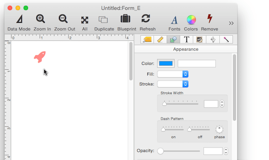
Icon buttons aren’t push button objects – they are actually Text Display Objects with the Rich Text option enabled.
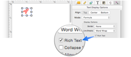
The Rich Text option allows styled text to be displayed using tags that begin and end with < and >. The <char> tag allows any Unicode character to be displayed using any font. Icon buttons take advantage of this to display characters from the Font Awesome icon font, which is included with Panorama X and automatically available with no additional installation. The Unicode character for the rocket icon is 0xf135.
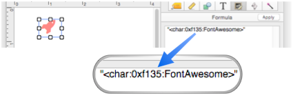
Normally you would have to look up the Unicode character value for an icon on the Font Awesome web site and type it into the Formula panel (as shown above), but the Font Awesome Icon wizard takes care of that for you. If needed, however, you can come back later and edit this value to change to a different icon.
The wizard shows you the tag that will be inserted when the Make Button icon is pressed.
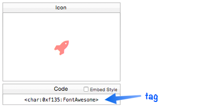
If you need to manually type in this tag somewhere (for example if you are changing an existing icon, or setting up a custom menu with an icon), you can drag the mouse over the tag text to select it, then copy and paste it wherever you need it.
Customizing the Icon Color and Size
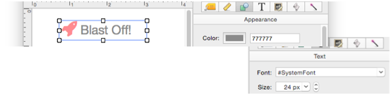
After the button is created you can still customize the color and size. To change the size, you not only need to change the size of the object, but also adjust the font size in the Text panel, as shown here.
You can also edit the Unicode value to change to a different icon, as described in the previous section.
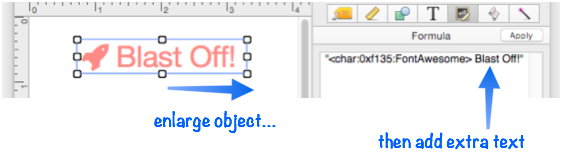
Adding Text to the Icon Button
Since the button is actually a Text Display Object, you can add text in addition to the icon. Simply enlarge the object, then type in the extra text into the Formula panel, as shown here.
The text is normally the same size and color as the icon, but it doesn’t have to be. If you want the icon to have a different style from the text, check the Embed style option when you make the button.
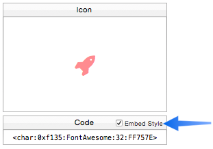
This embeds the size and color into the tag itself.
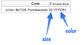
Since the size and color are now embedded in the tag, you can change the size and color of the overall object without affecting the icon. So in this example, the icon stays red even though the rest of the text has been switched to 24 point gray.
Of course you can embed the size and color manually at any time, not just when you create the icon with the wizard.
Dynamically Changing the Icon
Since the icon is specified with text, it’s easy to change the icon dynamically. To illustrate this, I’ll create a padlock icon that opens and shuts when you click on it. The padlock status is controlled by a variable named unLOCKED, if this variable contains YES the padlock is unlocked. (The catcherror( function ensures that the padlock defaults to locked if the variable hasn’t been defined yet.
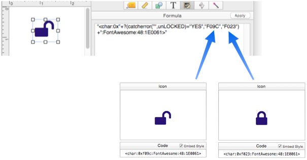
When the padlock is clicked, it the code switches the unLOCKED variable between "YES" and "".

That’s all you need for a working padlock button.
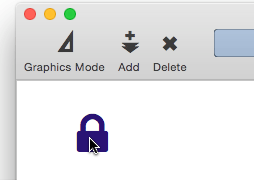
The button is completely self contained – no external procedure is required.
Opening Multiple Icon Windows
Sometimes you may want to open up two or more icon windows at the same time. To open a second window, just click the  icon. Each window is completely independent, so you can use different searches and display different icons in each window.
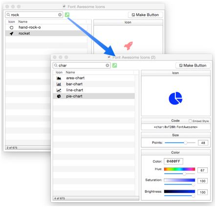
You can also open another window using the New Font Awesome command in the Window menu.
Icons in Push Buttons & Data Buttons
If the Rich Text option is checked, Font Awesome icons can be used in Push Button Objects and Data Button Objects (checkboxes & radio buttons).
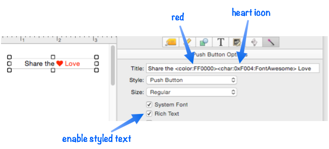
The Font Awesome Icons wizard won’t create these types of objects automatically, but you can use this wizard to generate the tag, which you can copy from the wizard and then paste into the object.
Icons in Custom Menus
To add icons to a custom menu, set the font to "#RichText".
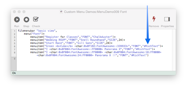
This code produces this custom menu which includes bold text (the word Cube) and various icons.
To learn more, see Custom Menus and Rich Text.
Using Other Icon Fonts and Dingbats
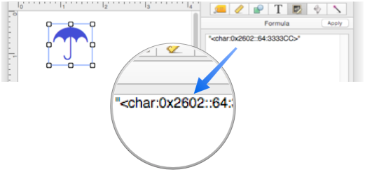
In addition to Font Awesome, you can use any other icon font installed on your computer, and Unicode also includes a number of icons and dingbats. These other fonts aren’t supported by the Font Awesome wizard, but you can type them in manually. For example, Unicode includes an umbrella icon. (Notice that no font is specified, because this is a standard Unicode character in the default system font.)
Here are some online resources for special Unicode characters.
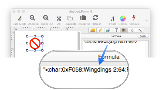
The Mac comes with 4 special fonts that have hundreds of icons: Webdings, Wingdings, Wingdings 2 and Wingdings 3. You can’t access these characters from the keyboard, only by using the <char> tag.
These fonts were originally created by Microsoft.
It’s surprisingly difficult to find online information about these fonts, but one handy tool for working with these fonts is PopChar X by Ergonis software.
History
| Version | Status | Notes |
| 10.0 | New | New in this version. |