The chart( function converts a table of data into an HTML page with a chart (bar, line, pie, etc.).
Parameters
This function has three parameters:data – the data points to be displayed in the chart, in a text array. Each data point is on a separate row (carriage return delimited). Within each row there must be two or more columns, separated by tabs (or commas). The first column contains the data point labels (for example for a chart that contains monthly data, this might be something like Jan, Feb, Mar, etc.). Subsequent columns contain numeric data values (in text form). (Note: Instead of carriage returns, each row can be separated by semicolons. This is useful when data is embedded directly into the parameter itself, for example "Platinum,68;Gold,49;Silver,34")
option – an option name. The chart( function can include one or more option/value pairs that customize the appearance of the chart, for example the type of chart (bar, line, pie, etc.), chart colors, margins, etc. These option/value pairs are discussed in more detail below.
value – option value (must appear as a pair with an option name).
Description
This function converts a table of data into an HTML page with a chart (bar, line, pie, etc.). It is designed to be used with Panorama’s Web Browser Object, and is usually used in combination with the summarytable( function or crosstab( function.
Chart Basics
To display a chart in Panorama, start by creating a Web Browser Object and changing the mode from Literal to Formula. Then type in the formula for a chart. For a basic bar chart, all you need is the chart( function with some data.
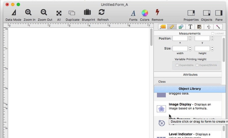
Instead of creating a chart manually like this, you can ask Panorama to create one for you. See the Summary Workshop and Crosstab Workshop to learn how to do this.
Charting Database Summaries
To make a chart that displays summarized database information, use the summarytable( function. This formula could be used in a checkbook database to display a bar chart of payment category totals (Advertising, Insurance, Rent, etc.)
chart(summarytable("Group","Category","Total","Debit","format","plainnototals"))
The resulting chart will look something like this:
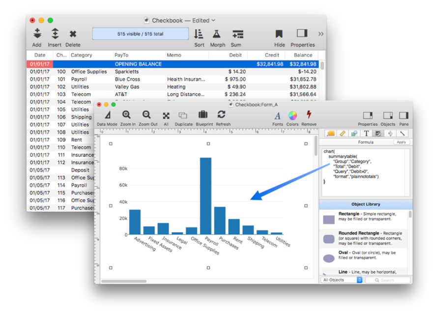
The illustration above shows the Checkbook data sheet in the background. Notice that this data has not been prepared in any way – no grouping to create summary records, etc. All of the necessary grouping and calculation is taken care of on-the-fly by the summarytable( function.
Notice that the summarytable( "format","plainnototals" option is used. This tells the function to generate data in plain format (no thousand separators, no title widths) and also not to generate a grand total line (since normally the grand total is not included in a chart).
To learn more about this function see the summarytable( page.
Another way to generate summarized data for the chart( function is with the crosstab( function. Just like when using the summarytable( function, you should use the "format","plainnototals" option when using this function with the chart( function.
Types of Charts
Use the chart option to specify the type of chart, for example a pie chart.
chart("Platinum,68;Gold,49;Silver,34;Uranium,56","chart","pie")
The available types are: bar, stacked bar, line, area, stacked area and pie.
Multiple Data Values
A chart can plot more than one data value per item. All items should have the same number of values, in this case two values per item.
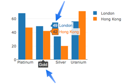
chart("Platinum,68,47;Gold,49,42;Silver,34,20;Uranium,56,71")
The resulting chart will show two bars for each item:
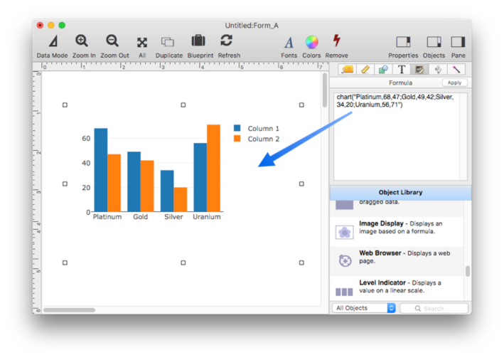
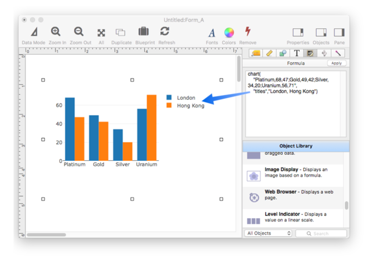
As shown above, a chart with multiple items will display a legend to the right identifying the values. By default, the values are named Column 1, Column 2 etc. To specify the value titles, use the titles option as shown here.
chart("Platinum,68,47;Gold,49,42;Silver,34,20;Uranium,56,71","titles","London, Hong Kong")
Now the chart legend shows the correct titles for each.
When you switch to data mode, you will also see the value titles when you hover over a chart element.
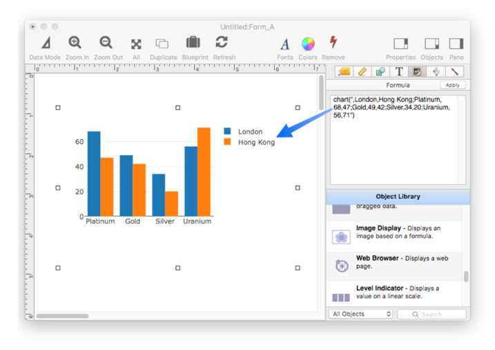
You can also embed the titles into the data itself. Just add a line at the top of the data with the titles. If the first line doesn’t contain numbers, the chart( function will assume it contains titles.
chart(",London,Hong Kong;Platinum,68,47;Gold,49,42;Silver,34,20;Uranium,56,71")
The resulting chart looks exactly the same as the last example.
Of course usually you’ll want to use database summaries, not fixed values. This example will display three bars per category: minimum, average and maximum.
chart(summarytable("Group","Category",
    "Minimum","Debit",
    "Average","Debit",
    "Maximum","Debit",
    "format","plainnototals"))
The resulting chart looks like this:
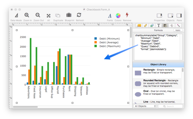
Notice that the titles in the legend have been set up automatically. The summarytable( function does this for you. If you wish, however, you can use the titles option to customize the titles (remember, however, that the titles option is part of the chart( function, not the summarytable( function.
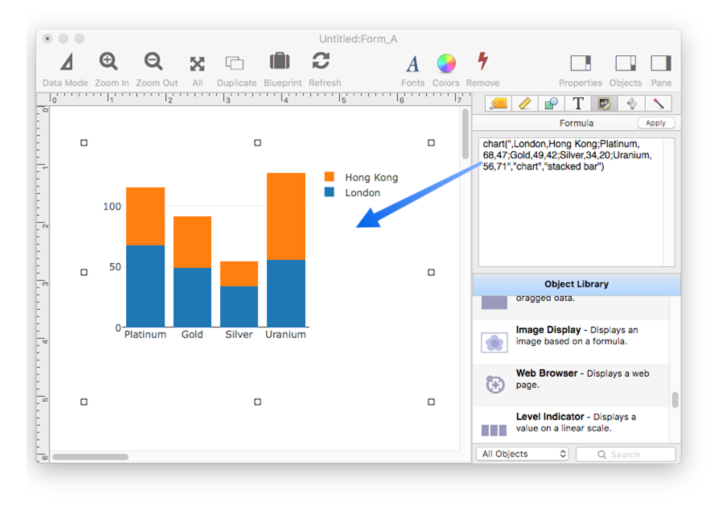
The bar and area charts can display multiple data values stacked on top of each other.
chart(",London,Hong Kong;Platinum,68,47;Gold,49,42;Silver,34,20;Uranium,56,71","chart","stacked bar")
Here is the stacked bar chart:
X and Y Axis Titles
To add titles to the axes, use the xaxistitle and/or yaxistitle options.
chart("Platinum,68,47;Gold,49,42;Silver,34,20;Uranium,56,71",
    "yaxistitle","Energy",
    "xaxistitle","Element")
The X axis title is displayed below the chart, the Y axis title is displayed on the left.
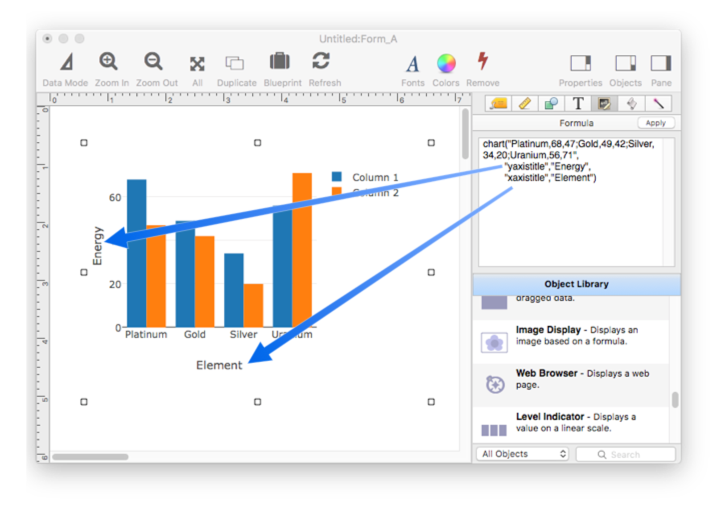
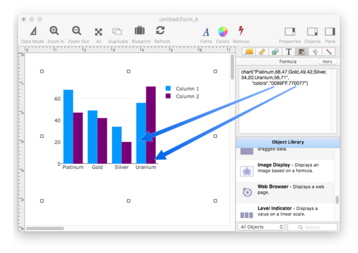
Chart Element Colors
Each chart element is normally assigned a color automatically, but you can override and specify the exact colors you want using the colors option. This option specifies a list of HTML colors separated by commas. This example will display a light blue and purple bar.
chart("Platinum,68,47;Gold,49,42;Silver,34,20;Uranium,56,71",
    "colors","0099FF,770077")
If there are three or more elements in the chart, another option is to specify colors using the htmlcolorarray( function, which generates a text array of HTML colors that gradually transition from one color to another. This example displays four bars per element in colors from red (FF0000) to purple (770077).
chart("Platinum,68,47,32,61;Gold,49,42,35,27;Silver,34,20,28,48;Uranium,56,71,33,60",
    "colors",htmlcolorarray("FF0000","770077",4))
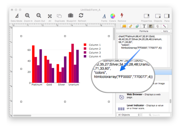
Chart Dimensions
The chart is usually automatically sized to fit into the Web Browser Object, with appropriate margins. You can, however, specify the dimensions manually with the height and width options. If these options are used, the dimensions are specified in points (1 point = 1/72 inch).
If you let Panorama automatically size the chart, it will add a 30 point padding area around each edge. You can customize this padding with the heightpadding and widthpadding options.
Chart Margins
The margins control how much space is taken up by the chart itself, and how much room is left for legends and titles. The default left and right margins are 40 points, the default top margin is 20 points, and the default bottom margin is 70 points. You can customize these dimensions with the leftmargin, rightmargin, topmargin and bottommargin options. This example displays a chart with a bottom margin of 36 points (1/2 inch).
chart("Platinum,68;Gold,49;Silver,34;Uranium,56","bottommargin",36)
Advanced Topic: Customizing Chart HTML
The chart( function normally generates all of the HTML needed to display the chart automatically, so you don’t have to worry about it. However, advanced users with HTML experience can customize every aspect of how the HTML is generated. (Some CSS and JavaScript knowledge may also be useful depending on the customization you want to do.)
Panorama uses the plotly.js JavaScript library to display charts. This library has many features that are not directly supported by Panorama, but by customizing the HTML you can use many of these features. You can find out more about plotly.js by following the previous link and by using Google.
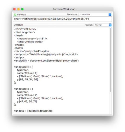
If you want to see the raw HTML code generated by the chart( function, use the Formula Workshop like this:
or use a Text Display Object like this:
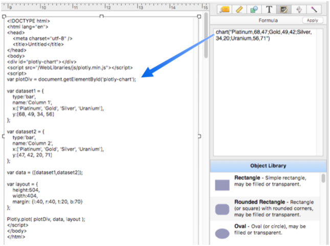
Chart HTML Template
Panorama contains a template that it uses for generating the chart HTML. You can use this formula to diretly access this template.
bundleresourcepath("ChartTemplate.html")
Here is the contents of this template (at the time this documentation was written, check using the formula above to make sure it hasn’t changed).
<!DOCTYPE html>
<html lang="en">
<head>
    <meta charset="utf-8" />
    <title>Untitled</title>
</head>
<body>
<div id="plotly-chart"></div>
<script src="«PLOTLYPATH»"></script>
<script>
var plotDiv = document.getElementById('plotly-chart');

«CHARTCODE»

Plotly.plot( plotDiv, data, layout );
</script>
</body>
</html>
You can use the template function to provide your own template. This example shows the template being loaded from a disk file, but you can also store it in a variable or even include the entire template as a constant inside the chart( function.
chart("Platinum,68;Gold,49;Silver,34;Uranium,56","template",fileload("MyChartTemplate.html"))
If you create your own template, you need to make sure to include the core of the standard template in your temmplate.
<div id="plotly-chart"></div>
<script src="«PLOTLYPATH»"></script>
<script>
var plotDiv = document.getElementById('plotly-chart');

«CHARTCODE»

Plotly.plot( plotDiv, data, layout );
Feel free to change any other part of the template.
Using an Alternate Plotly Library
Panorama includes a copy of the plotly.js library inside the application. Using this internal copy is much faster than accessing a copy of this library from somewhere on the web. However, you may want to use a different version of plotly.js, for example if you wanted to use the latest beta version of plotly.js or perhaps even have a version you have customized yourself.
To tell the chart( function to use a different version of plotly.js, use the plotly option. There are three ways you can use this option. First, if you have loaded your own copy of the library onto your computer, specify the local URL of that library (note that this is a URL, not a normal file path).
chart(…,"plotly","file:///users/joeblow/javascript/plotly.min.js")
To access a copy of the library on the web, supply the URL.
chart(…,"plotly","https://cdn.plot.ly/plotly-latest.min.js")
The URL above is the standard CDN (Content Delivery Network) copy of plotly.js, you can always find the latest copy there. To make this standard version easier to access, you can simply specify "CDN" and Panorama will automatically use this standard version.
chart(…,"plotly","cdn",…)
Note: The plotly.js library is fairly large, so you may encounter a delay when displaying charts if you use a web based version of the library. For fastest speed use a local copy of the library. In almost all cases you can simply use the version of plotly.js that is built in to Panorama.
Data Traces
Plotly.js calls each column of the input data a “data trace”. For each data trace a JSON structure must be set up that contains the data as well as options for how that particular data trace should be displayed. Here is an example of the code for a typical data trace:
var dataset1 = {
    type:'bar',
    name:'Column 1',
    x:['Platinum', 'Gold', 'Silver', 'Uranium'],
    y:[68, 49, 34, 56],
    marker: {
        color:'0099FF'
    }
};
Panorama normally generates this code for you, but using the tracecode option you can tell Panorama to insert additional JSON elements inside each trace. (See the plotly.js library documentation to learn about what elements can be added.)
chart(…,"tracecode",|||hoverinfo:'none'|||,…)
The supplied code will be inserted into the code for each trace, as shown here.
var dataset1 = {
    hoverinfo:'none',
    type:'bar',
    name:'Column 1',
    ...
Notice that the supplied code did NOT include a trailing comma, but Panorama automatically added the comma when inserting the element into the page. You should not include a trailing comma in the code you supply. If you want to insert two or more JSON elements you should either use multiple tracecode options, like this:
chart(…,"tracecode",|||textposition: 'auto'|||,"tracecode",|||hoverinfo:'none'|||,…)
which will insert two elements into each trace like this:
var dataset1 = {
    textposition: 'auto',
    hoverinfo:'none',
    type:'bar',
    name:'Column 1',
    ...
Alternately, you can use a single option with commas between the JSON elements, but not at the end, like this
chart(…,"tracecode",|||textposition: 'auto', hoverinfo:'none'|||,…)
which will insert the two elements into each trace on a single line, like this:
var dataset1 = {
    textposition: 'auto', hoverinfo:'none',
    type:'bar',
    name:'Column 1',
    ...
The code will operate the same whether the options are on a single line or multiple lines, it’s your choice.
Layout Options
In addition to the data traces, the generated code also contains a JSON structure with layout options. Here is a typical example:
var layout = {
    height:677,
    width:404,
    margin: {l:40, r:40, t:20, b:70}
};
Panorama normally generates this code for you, but using the layoutcode option you can tell Panorama to insert additional JSON layout elements. (See the plotly.js library documentation to learn about what elements can be added.)
chart(…,"layoutcode",|||bargap: 0.15|||,…)
The supplied code will be inserted into the layout code, as shown here.
var layout = {
    bargap: 0.15,
    height:677,
    width:404,
    margin: {l:40, r:40, t:20, b:70}
};
Notice that the supplied code did NOT include a trailing comma, but Panorama automatically added the comma when inserting the element into the page. You should not include a trailing comma in the code you supply. If you want to insert two or more JSON elements you should either use multiple layoutcode options, like this:
chart(…,"layoutcode",|||bargap: 0.15|||,"layoutcode",|||bargroupgap: 0.1|||,…)
which will insert two elements into each trace like this:
var layout = {
    bargap: 0.15,
    bargroupgap: 0.1,
    height:677,
    width:404,
    margin: {l:40, r:40, t:20, b:70}
};
Alternately, you can use a single option with commas between the JSON elements, but not at the end, like this
chart(…,"layoutcode",|||bargap: 0.15, bargroupgap: 0.1|||,…)
which will insert the two elements into the layout code on a single line, like this:
var layout = {
    bargap: 0.15, bargroupgap: 0.1,
    height:677,
    width:404,
    margin: {l:40, r:40, t:20, b:70}
};
Either way, the code will work the same way.
Fully Customized Charts
Perhaps you’d like to create a fully customized chart, for example combining bars and lines in a single chart. To do that you’ll need to skip Panorama’s automatic code generation and build the HTML entirely from scratch. However, the chart( function can still assist you by converting the data into JSON arrays and inserting it into your code. Use «1» to insert column 1, «2» to insert column 2, etc. (surrounded by single quotes for text instead of numeric data). Here is an example of a template that combines a bar and line into a single chart.
<!DOCTYPE html>
<html lang="en">
<head>
    <meta charset="utf-8" />
    <title>Untitled</title>
</head>
<body>
<div id="plotly-chart"></div>
<script src="«PLOTLYPATH»"></script>
<script>
var plotDiv = document.getElementById('plotly-chart');

var dataset1 = {
    type:'bar',
    name:'Column 1',
    x:['«1»'],
    y:[«2»]
};

var dataset2 = {
    type:'line',
    name:'Column 2',
    x:['«1»'],
    y:[«3»]
};

var data = ([dataset1,dataset2]);

var layout = {
    height:677,
    width:404,
    margin: {l:40, r:40, t:20, b:70}
};

Plotly.plot( plotDiv, data, layout );
</script>
</body>
</html>
To use this template, simply pass this text to the template option, described earlier. With a template like this, you only supply the data and the template. Any other options (color, legends, etc.) will be ignored, because Panorama is not automatically generating the code.
Panorama can help you create a template like this, so that you don’t have to do it completely from scratch. Start by setting up the chart( function to make a chart that is as close as you can to what you want. Then add the maketemplate option, as shown here.
clipboard() = chart(…,"maketemplate","yes")
When the maketemplate option is enabled, Panorama leaves placeholders for the data («1», «2», etc.) so that you can edit the HTML and then later pass it back as a template to the chart( function.
History
| Version | Status | Notes |
| 10.1 | New | New in this version. |