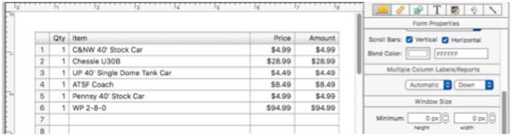
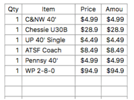
If you needed to construct a form for editing line item fields (like the one shown below) one object at a time, it would take quite a while. There are 65 objects in this form, it would be quite tedious to set each one up one by one by one.
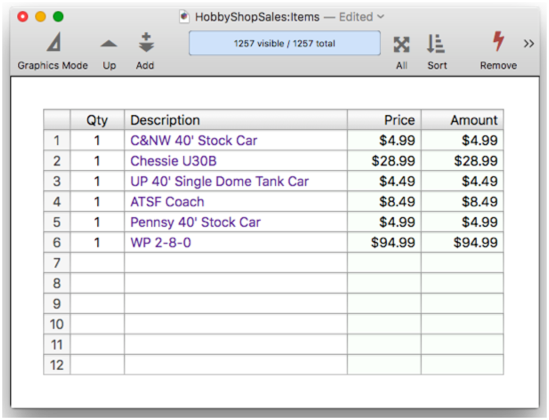
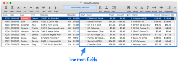
Fortunately, you don’t have to set these objects up one by one. Panorama includes a form constructor tool that can make a complete form like this in a minute or two. Let’s take a look at how it works. To illustrate this, I’ll use an invoice database with 12 sets of four line item fields (see Line Item Fields).
I’ll start with a new blank form (see Creating a New Form). To automatically create a form with a Text Editor Object for every line item field, I choose Line Items from the Construct menu. This opens a dialog sheet that allows you to edit a template that controls how the line item grid will be constructed, including a list of all of the line item fields in the database. (If you would prefer to edit the template in a separate window, hold down the Option key when choosing from the Construct menu.)
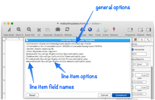
At this point you can edit the template to customize how the line items are arranged. Most of the rest of this page describes how this customization will work. For now, I am content to use the default template, so I simply press the Construct button. Panorama automatically creates 48 text editor objects, along with 4 text display objects for the header at the top.
That’s it – the form is done! You can switch to data entry mode and start displaying and editing data immediately.
Customizing the Automatically Generated Form
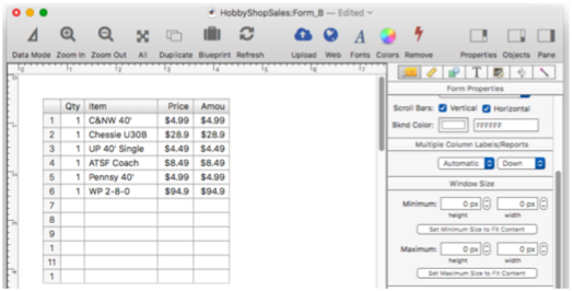
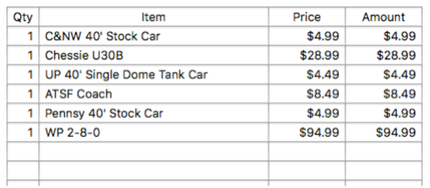
You can, of course, manually modify the form objects after they have been generated. But you can also modify the template and regenerate the form. For example, it might be nice if the Item, Price and Amount columns were wider. To do this, I open the Construct>Line Item dialog again, and edit the template to change the widths from 12, 6 and 6 to 36, 9 and 9.
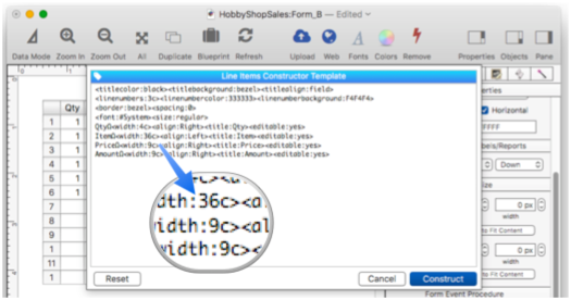
Pressing the Construct button regenerates the form objects with the wider columns. This already looks pretty good!
As long as you don’t modify the generated objects individually, you can go back and make additional modifications to the template at any time.
Constructor Tag Help Menu
There are about two dozen tags that you can use to customize the generated line item grid. There is complete documentation for all of these tags below, but if you just need a quick reminder while using the dialog, click the tag icon in the upper left. This displays a pop-up menu with all the available tags.
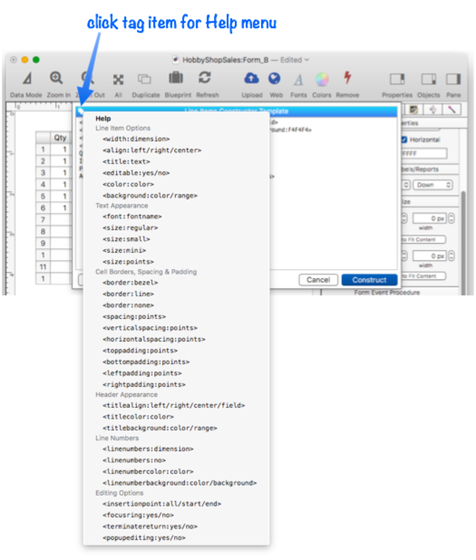
When you select a tag from the menu, that tag is automatically typed into the template at the current insertion point.
Manually Modifying Generated Objects
Once they are generated, you can manually modify individual objects by dragging them, resizing them, or using the object properties panel to modify their appearance and operation. Once you do that, however, you probably want to avoid running the constructor dialog again – doing so will undo any manual changes you have made.
However, you can move all the generated objects to a new position in the form, as long as you do so to the entire set. You can even add other objects to the form. These additional objects will be ignored if you re-run the constructor – they won’t be touched. To learn more about manually editing generated objects, see Automatic Form Construction.
Using Two Templates in a Single Form
It would be rare, but you may want to generate two line item grids in a single form – however, you can’t do that. But all is not lost – simply create each template in a different form, and then copy the finished results into the same form. Each form has its own separate constructor template.
Tag Language Reference
The template parameter allows you to customize how form elements are generated. You can specify which fields (or variables) are included, the size, alignment, etc. Each line item can have associated tags that customize the column for that line item field, and there are tags for overall options as well. The remainder of this page describes the details of the available tags.
Line Item Fields
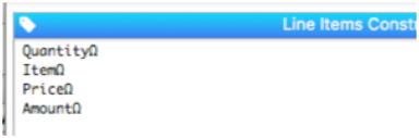
To specify which line item fields should be included in the generated form, simply include a carriage return delimited list of the fields. Use the Ω suffix instead of specific field numbers. This example will generate 4 columns of text editor objects (the number of rows will depend on the number of line item fields in your database).
QuantityΩ<width:30>
ItemΩ<width:3.8 inch
PriceΩ<width:4 cm>
AmountΩ<width:4 cm>
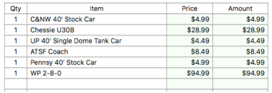
The width and alignment of each column in the grid will be determined automatically from the first corresponding line item field in the data sheet. In the example above, the width and alignment of the first column will match the Quantity1 field in the data sheet, the width and alignment of the first column will match the Item1 field, etc., as shown here:
You can customize the width and alignment of columns with special tags, described below.
Tags
To customize the generated form objects you can include one or more tags. Like HTML tags, these tags start and end with < and > characters. Some tags need to be attached to a specific line item field, for example to specify the width and alignment of a column. Other tags should be placed at the top of the template and control overall specifications – for example the font and text size.
Line Item Column Options
There are six properties that can be customized for each line item column: width, alignment, title, editability, color and background. The following sections describe each of these properties.
Width
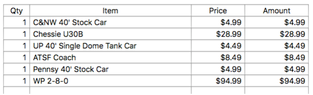
To customize the width of a column, use the <width:dimension> tag on the same line as the line item field name. The width is normally expressed in points (1 point = 1/72 inch) but you can also specify values in inches (1 in or 2.5 inch or 0.75") or centimeters (20 cm).
QtyΩ<width:36>
ItemΩ<width:3.5 inch>
PriceΩ<width:3 cm>
AmountΩ<width:3 cm>
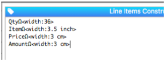
The output will look like this:
The width can also be expressed in characters by using the c suffix. When this option is used the width will be calculated as 0.7 times the font height, multiplied by the number of characters (so the number of characters that can be displayed is approximate). The advantage of this option is that it will automatically scale depending on the height of the text.
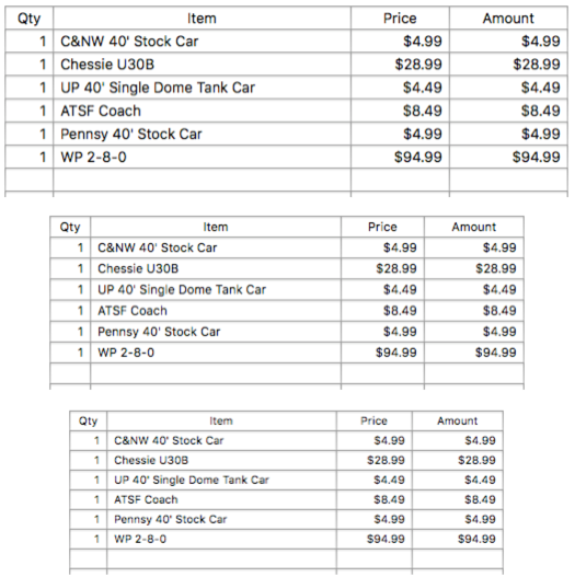
QtyΩ<width:5c>
ItemΩ<width:30c>
PriceΩ<width:10c>
AmountΩ<width:12c>
The nice thing about specifying the width in characters instead of using fixed dimensions is that you can change the font size without having to adjust the column widths, as shown here (all three of these tables are using the width specifications just above):
If the width tag for any field is omitted, the column width will default to the width of the first corresponding line item field in the data sheet.
Alignment
The alignment is normally set automatically from the data sheet, but the <alignment> tag can be used to specify a different alignment. The available options are left, right and center.
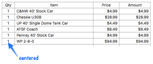
QtyΩ<align:center><width:5c>
ItemΩ<width:30c>
PriceΩ<width:10c>
AmountΩ<width:12c>
Even though the Qty1 field is right aligned in the data sheet, this template causes it to be centered in the form.
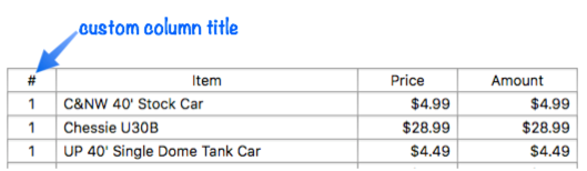
Column Title
Usually the line item field name is used as the title of each column (without the Ω suffix), or the field title if it has one. If you want to specify a different title, use the <title> tag on that line (you can use it on as many fields as you like):
QtyΩ<align:center><width:5c><title:#>
ItemΩ<width:30c>
PriceΩ<width:10c>
AmountΩ<width:12c>
Here is the result:
Non-Editable Columns
By default, all of the columns in the line item grid can be edited. However, you can use the <editable:no> tag to specify that one or more (or even all) columns will be display only, no data entry allowed. These columns will be created as Text Display Objects instead of Text Editor Objects.
For example, if the Price and Amount fields are automatically generated with a relational join and formula, you probably don’t want these fields to be edited manually. This can be achieved with this template:
QtyΩ<align:center><width:5c>
ItemΩ<width:30c>
PriceΩ<width:10c><editable:no>
AmountΩ<width:12c><editable:no>
The Price and Amount columns don’t look any different, but when you click on them, you’ll discover that they are not editable.
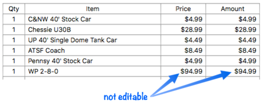
These columns will also be skipped when using the tab key.
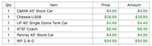
Column Text Color
Normally all text in the line item grid is displayed in black. However, you can use the <color> tag to specify a different color on a column-by-column basis. The color can be specified as hexadecimal red-green-blue values (for example 0000FF for blue), or as a color name (use info(“colornames”) for a list of available colors). This template will cause both the Price and Amount columns to be displayed with green text.
QtyΩ<align:center><width:5c><title:Qty>
ItemΩ<width:30c>
PriceΩ<width:10c><color:green>
AmountΩ<width:12c><color:008400>
Voila! Green text!
Column Background
Normally the line item grid has no background (which usually means the grid appears on a white background, unless there is some sort of color object below the grid). To specify a different background for a column, use the <background:> tag. The color can be specified as hexadecimal red-green-blue values (for example F0F0FF for light blue), or as a color name (use info(“colornames”) for a list of available colors). This template will cause both the Price and Amount columns to be displayed with a light green background.
QtyΩ<align:center><width:5c>
ItemΩ<width:30c>
PriceΩ<width:10c><background:F4FFF4>
AmountΩ<width:12c><background:F4FFF4>
The background colors work for both editable and non-editable columns.
The background can also be a gradient, see Text Object Background Color/Gradient to learn more.
Text Appearance (Font and Size)
By default, all text in the line item grid appears using the standard system font, in standard size (13 points).
To customize the font, use the <font:> tag. Use the <size:> tag to customize the size. The size can be expressed as regular, small or mini (13pt, 11pt or 10pt), or you can specify any numeric value (in points). This example creates the grid in 15 point Gill Sans.
<font:Gill Sans><size:15>
QtyΩ<width:5c>
ItemΩ<width:30c>
PriceΩ<width:10c>
AmountΩ<width:12c>
Here is the finished grid:
Cell Borders, Spacing & Padding
The line item grid normally has each element tightly packed, with a border around each element, but both of these attributes can be customized, as well as the padding between the border and the text.
The <border:> option specifies what type of border appears around each element: bezel, line or none (the default is bezel if there is no <border:> tag). If the bezel option is chosen, the bezel is always dark gray, no matter what the text color and background are set to. If the line option is chosen, the line color matches the text color, and the stroke width can be modified in the inspector panel (you can even make a dashed border).
The <spacing:> option adds padding between the cells. This option is normally specified in points, but can also be specified in inches or centimeters.
This example creates a line item grid with no borders, with an extra 4 points between each cell both vertically and horizontally. (You can also use the <verticalspacing:> and <horizontalspacing:> tags to specify different spacing in each direction.)
<border:none><spacing:4>
<titlebackground:black><titlecolor:white>
QtyΩ<width:5c><align:center>
ItemΩ<width:30c>
PriceΩ<width:10c>
AmountΩ<width:12c>
This template also displays the title using white text on a black background (described farther down on this page), which makes it easier to see the 4 point spaces betweeen each item.
To increase the padding between the text and the border there are 4 padding tags: <toppadding:>, <bottompadding:>, <leftpadding:> and <rightpadding:>. All padding values are normally set to zero (minimum). If you increase the top or bottom padding, the height of the rows will increase. This example slightly increases the top and bottom padding, creating a more “airy” grid.
<toppadding:2><bottompadding:1>
QtyΩ<width:5c>
ItemΩ<width:30c>
PriceΩ<width:10c>
AmountΩ<width:12c>
You can see that this line item grid has a bit more space above and below the text.
Header Appearance
The constructor generates a header of Text Display Objects at the top of the grid which displays the column titles. (If you don’t want this header, simply remove it afterwards in Graphics Mode.) By default the titles are displayed centered above each column in black text.
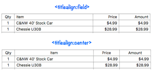
To customize the alignment of the titles, use the <titlealign:> tag. The available options are left, right, center and field. The field option aligns each title the same as the data in the corresponding field. In this example the Qty title will be centered, the Item title will be aligned to the left, and the Price and Amount titles will be aligned to the right (assuming these fields are right aligned in the data sheet).
<titlealign:field>
QtyΩ<align:center><width:5c>
ItemΩ<width:30c>
PriceΩ<width:10c>
AmountΩ<width:12c>
If the alignment is set to center, however, all four titles will be centered, no matter how the data is aligned in each column (this is the default).
<titlealign:center>
QtyΩ<align:center><width:5c>
ItemΩ<width:30c>
PriceΩ<width:10c>
AmountΩ<width:12c>
This illustration shows the difference between these two title alignment options:
To display the titles in a color other than black, use the <titlecolor:> tag. The color can be specified as hexadecimal red-green-blue values (for example 0000FF for blue), or as a color name (use info(“colornames”) for a list of available colors).
<titlecolor:royalblue>
QtyΩ<align:center><width:5c>
ItemΩ<width:30c>
PriceΩ<width:10c>
AmountΩ<width:12c>
This tag changes the color for all of the column titles.
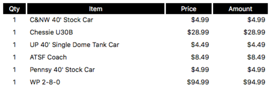
To change the background for the titles, use the <titlebackground:> tag. The color can be specified as hexadecimal red-green-blue values (for example F0F0FF for light blue), or as a color name (use info(“colornames”) for a list of available colors). This example will display the titles as white text on a black background, i.e. inverted.
<titlebackground:black><titlecolor:white>
QtyΩ<align:center><width:5c>
ItemΩ<width:30c>
PriceΩ<width:10c>
AmountΩ<width:12c>
The inverted titles look like this.
The background can also be a gradient. For a basic metallic gray gradient, set the background to bezel.
<titlebackground:bezel>
QtyΩ<align:center><width:5c>
ItemΩ<width:30c>
PriceΩ<width:10c>
AmountΩ<width:12c>
This is an easy way to add a touch of class to your line items:
See Text Object Background Color/Gradient to learn how to make your own custom gradients.
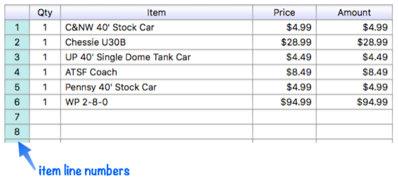
Line Numbers
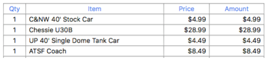
If you add the tag <linenumbers:yes> to the template, Panorama will add a column displaying line numbers to the left of the other columns. By default this column will be 3 characters wide (3c), but you can also explicitly specify the width, for example <linenumbers:4c> or <linenumbers:0.5">.
The line number color and background can be customized with the <linenumbercolor:> and <linenumberbackground:> tags. The color can be specified as hexadecimal red-green-blue values (for example F0F0FF for light blue), or as a color name (use info(“colornames”) for a list of available colors). This example displays a 4 character wide line number column on a powder blue background.
<titlebackground:bluebezel>
<linenumbers:4c><linenumberbackground:powder blue>
QtyΩ<align:center><width:5c>
ItemΩ<width:30c>
PriceΩ<width:10c>
AmountΩ<width:12c>
There is no column title above the line numbers:
The line number background can also be a gradient, see Text Object Background Color/Gradient to learn more.
Partial Line Item Grid
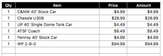
Normally all line items in the database are constructed. Use the <firstitem:number> and/or <lastitem:number> lastitem tags if you want to only generate a subset of line items. For example, suppose the database has 40 line items. If you want to generate only the first ten, add this tag:
<lastitem:10>
If you want to generate only lines 15 thru 25, add both tags:
<firstiem:15><lastitem:25>
Note: If you specify line items that don’t exist, Panorama will generate only the specified items that do exist. For example, if the database only had 20 line items, then the tags above would only generate items 15 thru 20.
Text Editing Options
These options allow you to customize how text editing works for the line item fields. All of the settings below are for the entire grid, you cannot apply them differently to different fields.
Initial Insertion Point
When you tab into a line item field, Panorama normally selects all the text in the field automatically (so that typing clears out whatever was already in the field). The <insertionpoint:> tag overrides this behavior.
<insertionpoint:start>
<insertionpoint:end>
<insertionpoint:all>
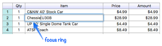
Focus Ring
Panorama normally displays a blue “focus ring” around the field currently being edited. If you don’t want this ring, use the <focusring:no> tag. If you’re not sure what we mean by “focus ring”, it looks like this:
Terminate Editing When Return Is Pressed
Line Item fields are normally set up so that pressing the Return key completes editing. If you don’t want this, use the <terminatereturn:no> tag. This allows carriage returns to be inserted into a line item field.
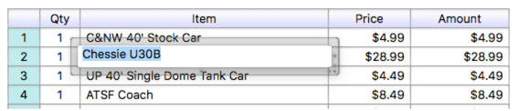
Pop Up Editing
If the <popupediting:yes> tag is included, the generated Text Editor objects will have the Popup Editing option enabled. This makes data editing work as it does in the Data Sheet, with a pop-up window for editing instead of editing text directly in the form window. Here’s an example of what the pop-up editor window looks like:
See Popup Editing on the Text Editor Object help page to learn more about this editing method.
See Also
- Automatic Form Construction -- creates a column of form elements for editing data fields (or variables).
- Automatic Mailing Label Construction -- creates a mailing label.
- Automatic Report Construction -- creates a tabular report with columns of data.
- Construct Menu -- used to automatically construct complex form applications, including calendars, lists, mailing labels, and more.
- count( -- counts all non-empty instances of a line item field in the current record.
- emptylineitemnumber( -- returns the numeric suffix of the first matching line item field that is empty (if any).
- Line Item Fields -- are used for repeating items within a record
- Matrix Constructor -- quickly creating a Matrix Object from a template.
- sum( -- adds up all instances of a line item field in the current record.
- Tab Panel Constructor -- quickly creating a Tab Panel Object from a template.
- Text Display Object -- is used to display text using a formula.
- Text Editor Object -- is used to edit text in a field or variable.
- Text List Constructor -- quickly creating a Text List Object from a template.
- Text Object Background Color/Gradient -- text object background colors and gradients.
History
| Version | Status | Notes |
| 10.2 | New | New in this version. |