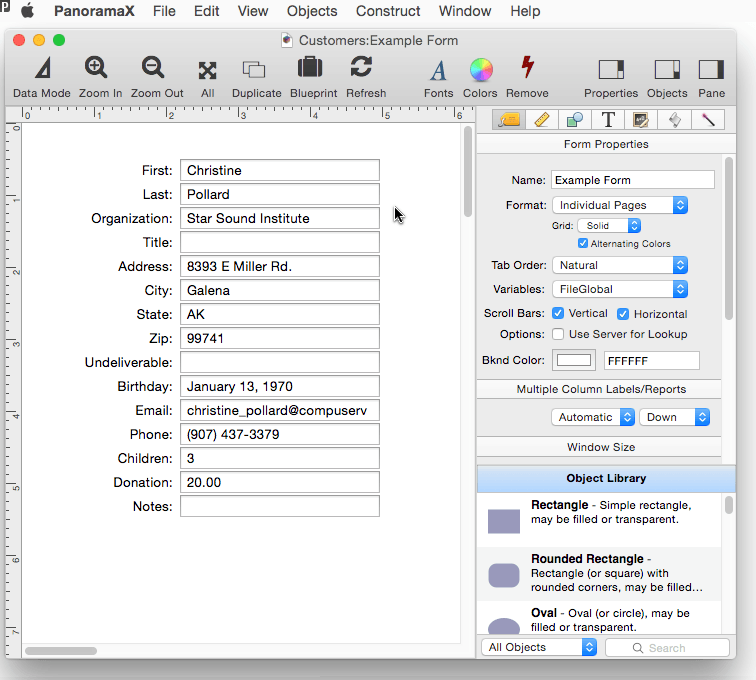
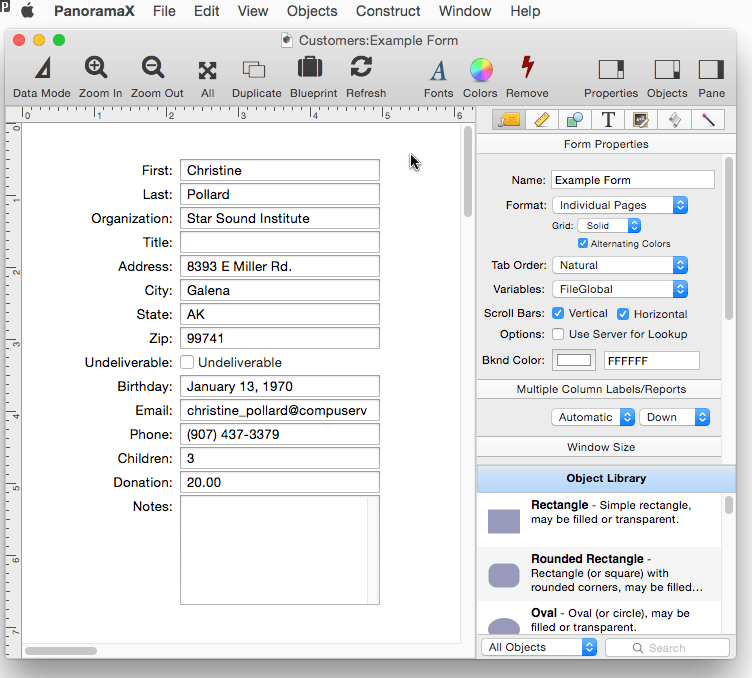
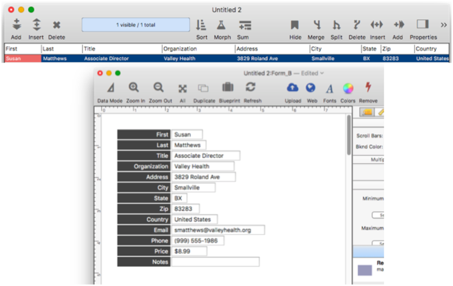
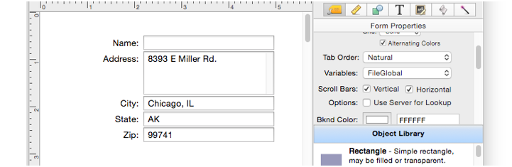
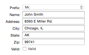
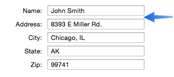
If you were going to construct a nice form like this one object at a time, it would take quite a while. There are 28 objects in this form; it would be quite tedious to set each one up one by one by one.
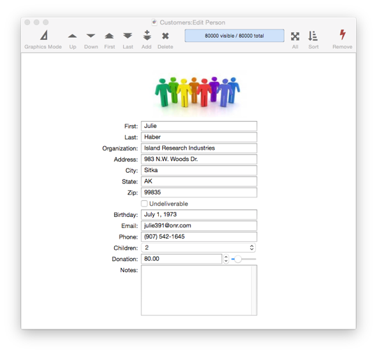
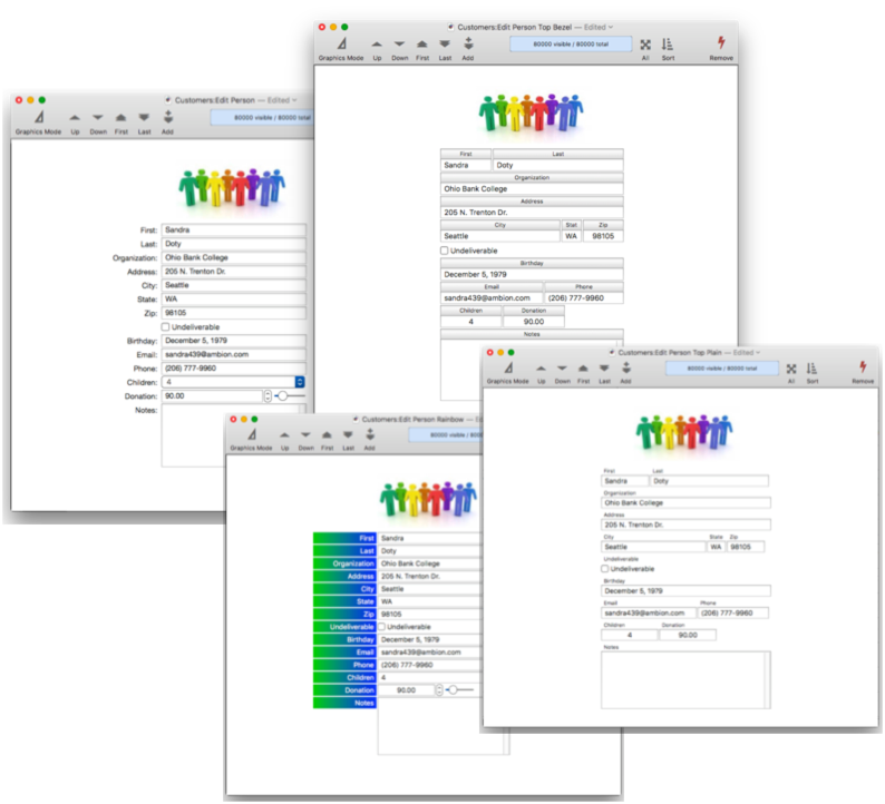
Fortunately, you don’t have to set these objects up one by one. Panorama includes a form constructor tool that can make a complete form like this in a minute or two. This constructor tool uses a template system that gives you tremendous flexibility in laying out a form. Here are four variations on the form above that were each created with very minor adjustment to the layout template. All four of these forms were created in less than ten minutes total.
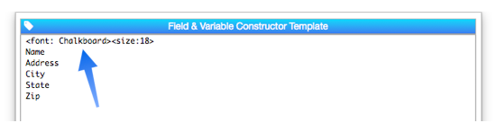
Let’s take a look at how this template system works. To illustrate this, I’ll use a customer list database with 14 fields.
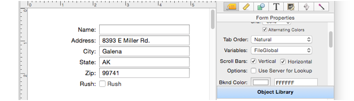
I’ll start with a new blank form (see Creating a New Form). To automatically create a form with a Text Editor Object for every field, I choose Fields and Variables from the Construct menu. This opens a dialog sheet that lists all of the fields in the database. If I wanted to omit some fields I could edit them out of the list. But since I want all of the objects, I simply press the Construct button. Panorama automatically creates 14 text editor objects, along with 14 text display objects with captions.
That’s it – the form is done! You can switch to data entry mode and start displaying and editing data immediately.
Customizing the Automatically Generated Form
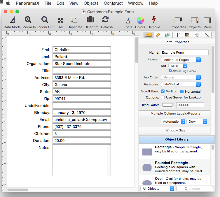
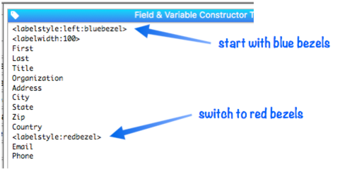
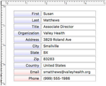
You can, of course, manually modify the form objects after they have been generated. But you can also modify the template and regenerate the form. For example, it might be nice if the Notes field was more than one line high. I can make it 5 lines high by adding the tag <lines:5> after the field name. Pressing the Construct button regenerates the form objects with the taller Notes field.
As long as you don’t modify the generated objects individually, you can go back and make additional modifications to the template at any time.
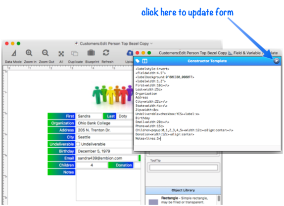
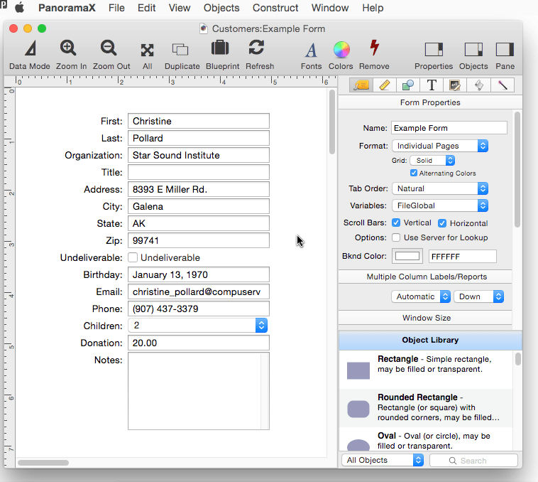
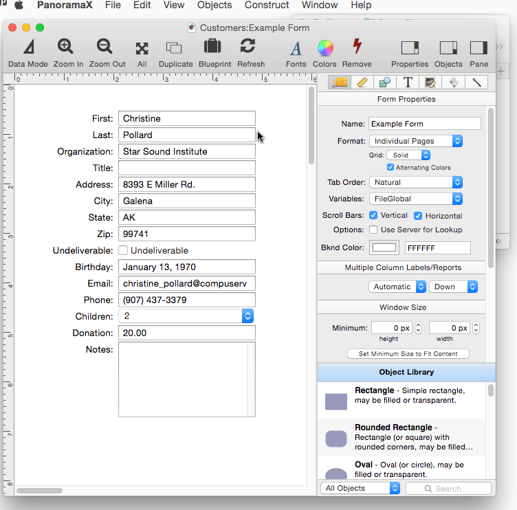
In addition to text editor objects, the template can also be used to construct checkboxes, radio buttons, pop-up menus, and scrolling list. In this example, the Undeliverable field is changed to a checkbox. (The on value for the checkbox is YES.)
Opening a Semi-Permanent Template Editor Window
If you’re doing a lot of work with a template, it can get tedious to have to keep re-opening the dialog sheet over and over again. If you hold down the Option window when you click on the Construct menu, the template will open in a separate window. You can edit the template in this window, and then either press the Play button or press the Enter key on the keyboard to update the form with the changes. This separate editor window will stay open until you explicitly close it, making it much easier to make iterative changes to the template and see the results.
If you would prefer to always open templates in a separate window, choose that option in the General panel of the Preferences dialog.
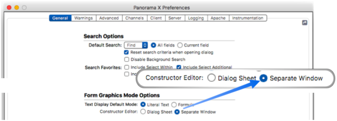
If you select Separate Window as the default, holding down the Option key will temporarily open the dialog sheet (in other words, the normal operation is exactly reversed.)
Constructor Tag Help Menu
There are about two dozen tags that you can use to customize the generated form objects. There is complete documentation for all of these tags below, but if you just need a quick reminder while using the dialog, click the tag in the upper left. This displays a pop-up menu with all the available tags. When you select a tag from the menu, that tag is automatically typed into the template. In this example I use the tag menu to change the Children text editor into a pop-up menu.
Fields Help Menu Right next to the tag icon is another icon that pops up a list of database fields when you click on it. Choosing a field from this menu inserts the field name into the template at the current insertion point.
Manually Modifying Generated Objects
Once they are generated, you can manually modify individual objects by dragging them, resizing them, or using the object properties panel to modify their appearance and operation. Once you do that, however, you probably want to avoid running the constructor dialog again – doing so will undo any manual changes you have made.
However, you can move all the generated objects to a new position in the form, as long as you do so to the entire set. You can even add other objects to the form. These additional objects will be ignored if you re-run the constructor – they won’t be touched. Watch this movie carefully as multiple steps are performed:
- The previously generated objects are selected as a set and moved down a bit in the form to make room at the top.
- A logo image is dragged onto the top of the form and the position adjusted.
- The Constructor dialog sheet is opened, and the template is edited to remove the label from the Undeliverable checkbox.
- The automatically constructed objects are regenerated. Notice that the logo image is not touched, and the objects are generated in the new position.
Using Two Templates in a Single Form
You may want to generate objects using more than one template in a single form – however, you can’t do that. But all is not lost – simply create each template in a different form, and then copy the finished results into the same form. Each form has its own separate constructor template.
Tag Language Reference
The template parameter allows you to customize how form elements are generated. You can specify which fields (or variables) are included, the size, alignment, etc. Each item can have tags that customize the generated object, and there are tags for overall options as well. The remainder of this page describes the details of the available tags
Fields & Variables
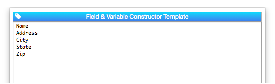
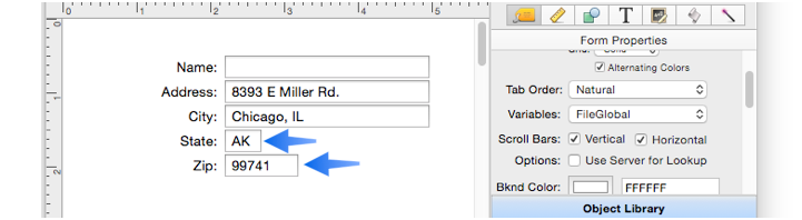
To specify which fields (or variables) should be included in the generated form, simply include a carriage return delimited list of the fields and/or variables. This example will generate 5 text editor objects, for the Name, Address, City, State and Zip fields.
If you want to edit a variable, just type in the name of the variable. If you want to edit a field name, make sure you spell it correctly, otherwise a variable will be automatically created instead.
Tags
To customize the generated form objects you can include one or more tags. Like HTML tags, these tags start and end with < and > characters. Some tags need to be attached to a specific field or variable, for example to specify generating a pop-up menu, checkbox, radio button etc. instead of a regular text editors, or to specify min and max values for a field or variable. Other tags should be placed at the top of the list where they will control overall specifications – for example the font and text size. If you are creating a dialog, the constructor can even generate the buttons for you.
Field Labels
The constructor automatically adds a label for each field or variable. By default the label is displayed to the left of the field or variable, but the label can also be above. The label can appear without a background, or with a color or gradient background. A wide variety of label appearances can be constructed with the <labelstyle> tag, as shown in this table:
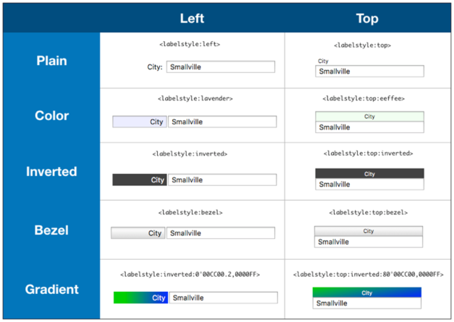
As shown in the table above, the <labelstyle> tag can include one or more options, with each separated by a colon. The available options are:
Position – The position can be either left or top. If you don’t specify a position, left is assumed.
Inverted – If this option is specified, the label will be displayed using white text on a dark gray (nearly black) background.
Bezel – This option causes the label to be displayed on a metallic gray bezel. You can also specify one of six metallic color options for the bezel: bluebezel, greenbezel, redbezel, purplebezel, yellowbezel or cyanbezel.
Color – If a color is included, it is used for the background of the label. The color can be specified by name (there are about 200 named colors available, use the info(“colornames”) function to see the full list), or as an RRGGBB hex color, for exammple
0000FFfor pure blue orFF0000for pure red.Gradient – To display a gradient, the option must include two or more colors in RRGGBB format, with each color separated by a comma. See Text Object Background Color/Gradient to learn the exact details of specifying gradients.
The <labelstyle> tag is normally placed at the top of the template, above any field or variable names. However, you can include more than one <labelstyle> tag, each one will apply to the fields below it.
Here’s the generated form objects showing the change in style.
As you can see, the <labelstyle> tag offers a lot of variety, but for even more options you can use the tags listed below.
<labelposition:left/top>specifies whether the label should appear to the left of the field or variable, or above it.<labelalign:left/right/center>specifies how the text will be horizontally positioned within the label area.<labelwidth:dimension>specifies the width of the labels, which may be specified in points, inches, centimeters or characters (csuffix). If the<labelwidth>tag is included on the same line as a field or variable name, it applies only to that item, otherwise it applies to all items. If the width dimension is zero, Panorama will automatically calculate the width by measuring the text. The default is 120 points, or 0 (automatic) if the template includes multiple items on a single row (explained farther down on this page).<labelverticalalign:top/center/botton>specifies how the text will be vertically positioned within the label area.<labelborder:none/bezel/line/round>specifies whether the label area will have a border around it, and if so, the border style.<labelsize:points>specifies the size of the label text. You can specify regular, small or mini, or you can specify any value you want in points. If no label size has been specified, it defaults to 4 points less than the primary text size (the size specified for field/variable editing) if the label is on top, or the same size as the primary text size if the label is placed on the left.<labelfont:font>specifies the name of the font to be used for the label text. If this tag is omitted, the label font will be the same as the primary text font (the font specified for field/variable editing).<labelcolor:color>specifies the color of the label text. This may be either a color name (for example red or dark blue, use the info(“colornames”) function for a complete list), or an RRGGBB color (for exampleFF0000for pure red or000099for dark blue). If no color is specified, the default is black.<labelbackground:color/gradient>specifies the background color or gradient for the label area. The color can be specified by name (there are about 200 named colors available, use the info(“colornames”) function to see the full list), or as an RRGGBB hex color, for exammple0000FFfor pure blue orFF0000for pure red. To display a gradient, the option must include two or more colors in RRGGBB format, with each color separated by a comma. See Text Object Background Color/Gradient to learn the exact details of specifying gradients. If no background is specified, it will be transparent.
Keep in mind that once the form is generated, all of these options can be modified at any time using the Form Object Propeties panel.
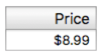
You can use these tags on their own, or in combination with the <labelstyle> tag. When used in combination, the <labelstyle> tag should appear first, then the following tags will modify the options. Here’s an example that starts with the top:bezel style, but then modifies it by using 15 point Gill Sans and aligning the label on the right.
<labelstyle:top:bezel>
<labelfont:Gill Sans><labelsize:15>
<labelalign:right>
Price
Here is the result:
Customizing the Label Text
Normally the text of the label is the same as the field or variable name, but you can specify different text with the <label:text> tag, as shown below. Note that when you specify a custom label, you must include any punctuation before or after the label text (in this example colons).
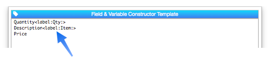
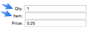
Now the first two labels are custom, instead of the actual field names.
You can also eliminate the label entirely by changing it to a single space.
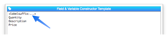
Label Suffix When the label is on the left with no background, Panorama automatically adds a colon as a suffix (the colon is not added automatically if the label is positioned on top or if there is a background).
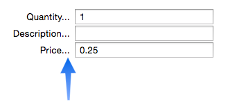
Whether it is added automatically or not, you can always change the suffix using the <labelsuffix:value> tag, and also add a prefix if you like with the <labelprefix:value> tag.
Here is the custom prefix on the generated form.
Note: The custom prefix and suffix are not added when you specify custom label text with the <label:text> tag.
Text Editors
The main body of the generated form is a series of Text Editor Objects, one for each specified field or variable. Using additional tags on the same line as the field/variable name, you can customize the appearance and operation of the editor objects.
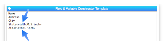
Text Editor Width
To customize the width of a single text editor, use the <width:dimension> tag on the same line as the field or variable name (this tag also works with Popup buttons and Text List objects, see below). The width is normally expressed in points (1 point = 1/72 inch) but you can also specify values in inches (1 in or 2.5 inch or 0.75") or centimeters (20 cm).
The <width> tag only overrides the width for the line it is on. All other editor objects use the default width (see Geometry section below to learn how to set the width for all objects).
Instead of specifying the width in absolute dimensions, you can specify it in characters by adding a c suffix to the dimension. For example 15c is fifteen characters. The advantage of using characters is that they will scale depending on the font size, so you don’t have to adjust all the widths if you later change the font size. Panorama considers the width of a character to be 0.7 times the font height, so 10c will be 91 points for 13 point text, but only 63 points for 9 point text. The disadvantage of this technique is that it’s difficult to do precision layout. Remember, however, that you can always manually tweak the dimensions after the objects are created.
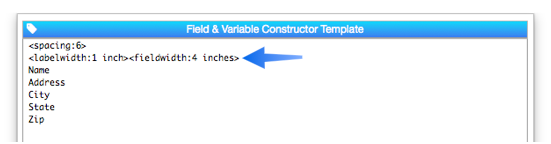
To specify the default width for all text editors, place the <width> tag at the top of the template, on a separate line from any field or variable. For example, this template will set the width of all of the text editors to 4 inches (288 points). (Note: The <width> tag can also be written as <fieldwidth>, as shown in this image.)
Here is the result:
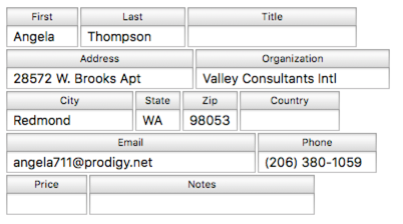
A final option is to use the <variablewidth> tag at the top of the template. If this tag is used, Panorama will adjust the widths based on the width of each field in the data sheet. Here is a template set up to use variable widths:
<variablewidth>
<labelstyle:invert>
First
Last
Title
Organization
Address
City
State
Zip
Country
Email
Phone
Price
Notes
This illustration shows the data sheet, and the form that is generated from this template.
When you set up the template to arrange multiple items on a single row (described below), the variable width option is enabled by default.
Note: Even when the variable width option is in effect, you can still override the width for a particular item by using the <width> tag, as described above.
Arranging Multiple Items on a Single Row
Normally the text editor objects are arranged vertically, but it is possible to arrange them horizontally by placing them on the same line in the template, separated by the special continuation tag: -->. When this tag is encountered, Panorama will place the next object to the right, instead of below. This option works especially well with the labels placed above the fields, as done in this template:
<labelstyle:top:bezel>
First-->Last-->Title
Address-->Organization
City-->State-->Zip-->Country
Email-->Phone
Price-->Notes
Here is the generated form:
Right Justifying Form Rows – The generated form above looks a bit ragged on the right edge. This can be fixed by adding a <justify:width> tag to the template. This tag specifies how wide we want each row to be, you must specify a width that is wider than each row is naturally.
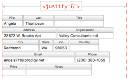
Here is the result with justification. Panorama has extended the last cell in each row to the justification point, in this case 6 inches (you can also specify in points, centimeters, or columns).
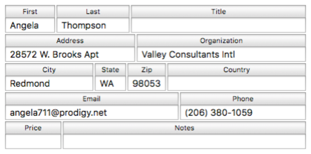
Snapping Individual Items to a Grid – The right justified form looks a lot better, but there are still unfortunate misalignments between items on different rows.
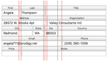
To fix this, use the <grid:width> tag (can also be called the <snap:width> tag). With this tag in the template, Panorama will extend the width of each item to match the specified grid, in this case 1/2 inch.
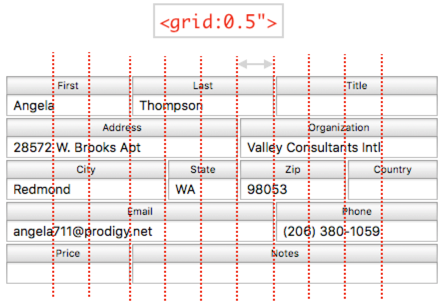
Keep in mind that Panorama will always expand the items to make them align with the grid, it will never make an item shorter. If the right edge of an item is one point past the grid line, it will be extended to the next grid line. In some cases, you may need to increase the justify width to accomodate the expanded cells. Of course you can always manually adjust the objects later for exact adjustments to the pixel, but the beauty of the <justify> and <grid> tags is that they facilitate the creation of very attractive forms in seconds, with no time consuming fiddling and noodling.
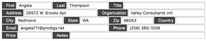
Using Justify and Grid with Labels on the Left – The <justify> and <grid> tags can also be used with labels on the left. Because of the extra space needed for the labels, you will probably have to either significantly increase the justification width or rearrange the items to put fewer items per row. (Or you could use the <size> tag to reduce the font size). The template from in the previous examples must be expanded to 9 inches justified width to allow the labels to be moved to the left.
<labelstyle:left:invert>
<justify:9"><grid:0.5">
First->Last-->Title
Address-->Organization
City-->State-->Zip-->Country
Email-->Phone
Price-->Notes
This template also changes the label style from bezel to invert, here is the result:
Text Editor Height
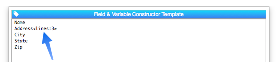
To change the height of a text editor or list object, use the <lines:count> tag. In this example all the fields will be one line high except for the Address field, which will be three lines high.
Here is the result:
The height doesn’t have to be an integer number of lines, but it does have to be at least 1. If the height is more than 2 lines high, a vertical scroll bar will be included in the editor object (of course you can manually remove it at any time).
Objects generated by the <list> tag are normally six lines high, but you can set the height to anything you want.
Non Editable Text (Display Only)
Sometimes you may want a field to be displayed, but not editable. To do this, place the tag <editable:no> on the same line as the field name (this also works with variable names). When the form is generated, a Text Display object is generated here instead of a Text Editor object. So you can’t click into it to edit, and can’t tab to it (it will be skipped). This example template includes two non-editable fields, Discount and Dealer.
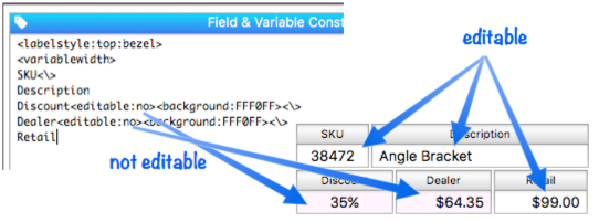
The user working with this form can edit the Retail price, which will then modify the Dealer price based on a formula; but they won’t be able to edit the Dealer price directly.
Usually non-editable fields look the same as any other field. Until you click them, they are exactly the same. In this example, the template sets a light purple background color to differentiate the non-editable fields. But this is not necessary, you can use a different background or leave the background off entirely.
Prompts
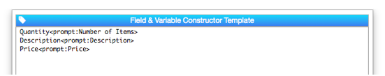
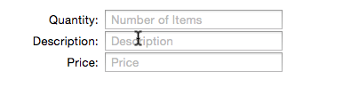
You can optionally specify that a prompt will appear when a field or variable being edited is empty. The prompt appears in gray text, and disappears as soon as the first character is entered into the field or variable. Use the <prompt:text> tag to specify a prompt for each line.
The prompt appears when the field or variable is empty, and disappears as soon as the first character is typed.
If you put an <autoprompt> tag at the top, the field or variable name will automatically be used as the prompt (unless a prompt is explicitly specified). The example below will produce exactly the same form objects as the example above. In this example, the prompts for the Description and Price fields are generated automatically.
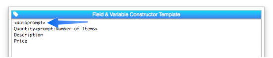
Note: It’s rarely necessary, but you can also enable and disable automatic prompts by using <autoprompt:yes> and <autoprompt:no>.
Font and Size
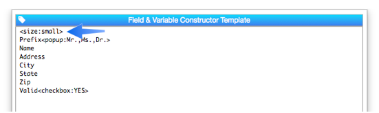
You can change both the font and size of generated objects. Changing the size is more common; to do that use the <size:points> tag. Normally you would do this just once at the top. This example will generate text objects with text that is 1/3rd inch high (24 points)
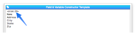
Oh my, that text is big!
You can also specify that the size is regular (13 points), small (11 points) or mini (10 points). Note: Some objects, including checkboxes, radio buttons, and pop-up menus, can only be generated in these three sizes. You can’t make a 24 point checkbox, for example. You can, however, specify these three sizes either numerically or by their names (regular/small/mini).
This produces a nice and compact layout:
Use the <font:name> tag to change the font. If this tag is omitted, the system font will be used.
Here is the form with the custom font:
Spacing Between Objects
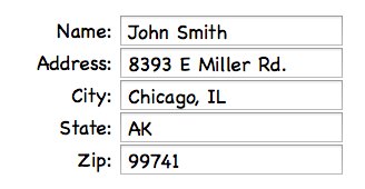
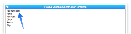
Use the <spacing:distance> tag to specify how far apart the objects should be placed. The default is 2 points, but you can set it to larger or smaller values (even 0, though you probably don’t want to do that. This example spaces the objects 1/12th inch (6 points) apart.
You can see the extra spacing between the objects.
When there are multiple items on the same row, you can specify different horizontal and vertical spacing with the <hspacing> and <vspacing> tags. You can use these tags to jam the items together or to spread them out, or both as shown here.
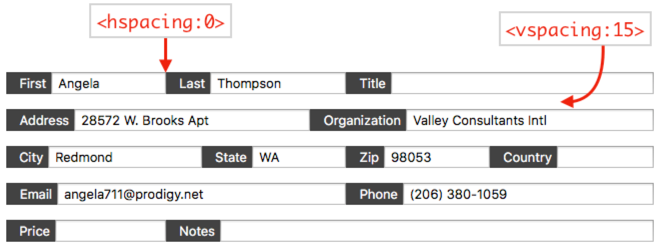
Note: The <spacing> tag sets both the horizontal and vertical spacing to the same value.
Text Editor Border Appearance
If you don’t wan’t a border around the Text Editor objects, put a <border:none> tag near the top of the template (above the field definitions).
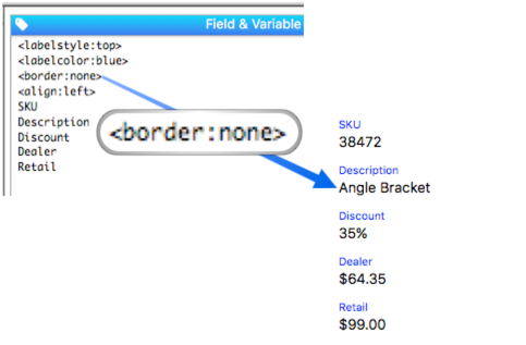
The other available border choices are bezel (the default), line and round (or rounded).
Padding between the Border and the Text – There are four <padding> tags that can be used to specify space between the text and the border on all four edges of each item.
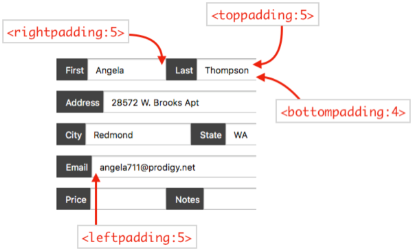
Adding padding can give a form a more “spacious” feel.
Text Editing Options
These options allow you to customize how text editing works for each field or variable. All of the settings below are for the entire form; you cannot apply them differently to different items. (Of course you can do this manually after the items are generated.)
Initial Insertion Point
When you tab into a field, Panorama normally selects all the text in the field automatically (so that typing clears out whatever was already in the field). The <insertionpoint:> tag overrides this behavior.
<insertionpoint:start>
<insertionpoint:end>
<insertionpoint:all>
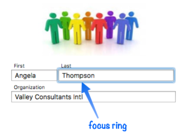
Focus Ring
Panorama normally displays a blue “focus ring” around the field currently being edited. If you don’t want this ring, use the <focusring:no> tag. If you’re not sure what we mean by “focus ring”, it looks like this:
Terminate Editing When Return Is Pressed
Line Item fields are normally set up so that pressing the Return key completes editing. If you don’t want this, use the <terminatereturn:no> tag. This allows carriage returns to be inserted into a line item field.
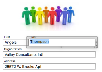
Pop Up Editing
If the <popupediting:yes> tag is included, the generated Text Editor objects will have the Popup Editing option enabled. This makes data editing work as it does in the Data Sheet, with a pop-up window for editing instead of editing text directly in the form window. Here’s an example of what the pop-up editor window looks like:
See Popup Editing on the Text Editor Object help page to learn more about this editing method.
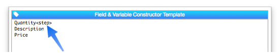
Adding a Numeric Value Stepper to a Text Editor
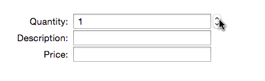
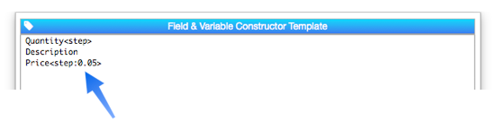
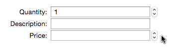
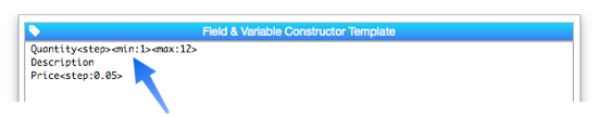
The <step>, <min> and <max> tags customize text editor objects for numeric values. Use the <step> tag to automatically generate a stepper object to the right of the text editor:
Watch the resulting form in action:
The step value is normally 1, but you can set it to any numeric value. In this example, the stepper will increment or decrement the price by a nickel each time it is clicked.
Here is this stepper in action.
If you set a maximum value, a slider object will also be generated. In this example, the slider can be used to adjust the quantity from 0 to 12.
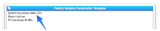
The slider appears to the right of the text editor object (and the stepper, if there is one).
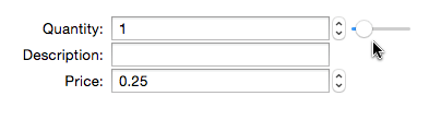
In the movie above you may notice that the slide goes to zero. If you don’t want that, you can also set a minimum value, in this case, a minimum of one, not zero.
Note: Setting a minimum and maximum doesn’t prevent values larger or smaller than this from being typed into the text editor. If that is necessary, you would need to add additional programming.
Other Editor Controls
Instead of a standard text editor, you can also specify that a field or variable be edited with various types of buttons, including checkboxes, radio buttons, pop-up menus and text lists. You can also automatically generate push buttons in the form.
Checkboxes
Use the <checkbox:value> or <check:value> tag to generate a checkbox. The tag should be on the same line as the field or variable name. This example generates five text editor objects and a checkbox.
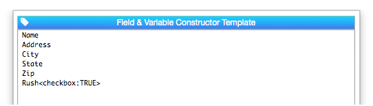
As you can see, the on value of the checkbox is specified after the colon (the off value is always blank). If you don’t specify the on value, it defaults to "TRUE". Here is the form generated by this template:
You can optionally supply a title for the checkbox that is different from the field name. For example, this code will genate a checkbox that is linked to the Rush field, but will have a title of Rush Order.
Rush<checkbox:TRUE:Rush Order>
Just like in the previous example, the Rush field will be assigned the value TRUE when the checkbox is clicked (and empty when it is unclicked).
Checkbox Groups
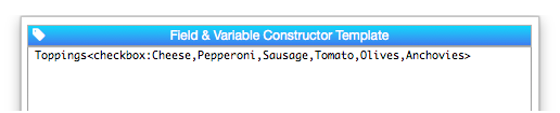
If the checkbox tag has multiple values, a group of checkboxes will be created. Unlike a group of radio buttons, this allows multiple values to be checked.
Here is the form generated by this template:
If multiple values are checked, the values will be separated by a separator character (or characters). The default separator character is a carriage return, but you can use the <separator:text> tag to specify any separator text you want.
If you want the checkbox titles to be different from the values, you can add a separate title for each item.
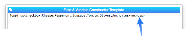
Toppings<checkbox:c:Cheese,p:Pepperoni,s:Sausage,t:Tomato,o:Olives,a:Anchovies>
With this code, the form will look the same, but the data values stored in the Toppings field will be single characters, for example c,p instead of Cheese,Pepperoni.
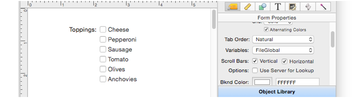
The checkboxes are normally arranged vertically, but if the <across> tag is included on the same line they will be arranged horizontally.
Note that if checkboxes are arranged horizontally, the widths will be approximate, as seen here.

You will probably have to manually adjust the arrangement a bit for the best appearance.
Pop Up Menus
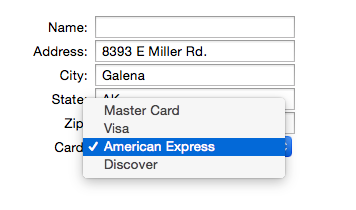
Use the <popup:value,value,value> or <menu:value,value,value> tag to generate a pop-up menu. The tag should be on the same line as the field or variable name. This example adds a pop-up menu for the credit card type.
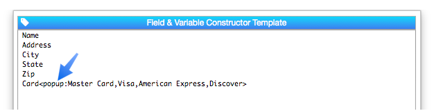
Here is what this form will look like:
As shown in the example above, the <popup> tag includes a comma separated list of the items to appear in the pop-up menu. If you need to include a comma in a menu item, you can specify the items with separate <value> tags, described below.
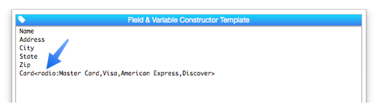
Radio Buttons
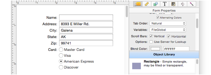
Use the <radio:value,value,value> tag to generate a group of radio buttons. The tag should be on the same line as the field or variable name. This example adds a text list for the credit card type.
The radio buttons are normally arranged vertically, with one radio button per line.
If you want the radio button titles to be different from the values, you can add a separate title for each item.
Card<radio:m:Master Card,v:Visa,a:American Express,d:Discover>
With this code, the form will look the same, but the data values stored in the Card field will be single characters, for example m instead of Master Card.
If you want to arrange the radio buttons horizontally, use the <across> tag, like this:
Card<radio:Master Card,Visa,American Express,Discover><across>
Note that if radio buttons are arranged horizontally, the widths will be approximate. You will probably have to manually adjust the arrangement a bit for the best appearance.
As shown in the examples above, the <radio> tag includes a comma separated list of the items to appear in the pop-up menu. If you need to include a comma in a menu item you can specify the items with separate <value> tags, described below.
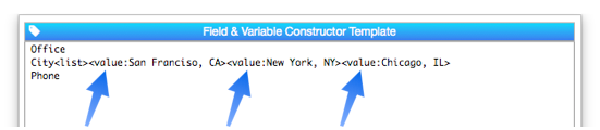
List
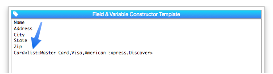
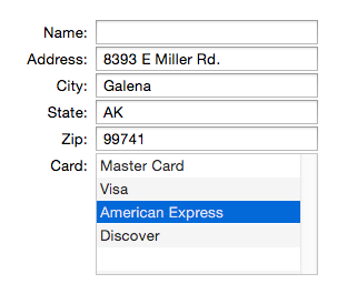
Use the <list:value,value,value> tag to generate a list. The tag should be on the same line as the field or variable name. This example adds a text list for the credit card type.
Here is the form generated from this template:
As shown in the example above, the tag includes a comma separated list of the items to appear in the pop-up menu. If you need to include a comma in a menu item you can specify the items with separate <value> tags, described below.
Lists default to six lines high. If there are more than six items in the list, you can scroll the list. You can also change the generated height of the list with the <lines> tag, described below.
Values with Commas
If you need to include values with commas with the <popup>, <radio>, or <list> tags you can specify the values in separate
This example generates a text list object with three choices, all of which contain commas.
When you use the <value> tag, you should not include a value in the primary object tag itself.
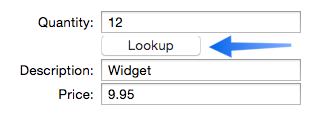
Push Buttons
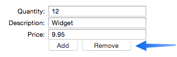
To generate one or more push buttons on a row, use the <button:title> or <buttons:title,title> tags. You can create multiple buttons either with multiple <button> tags or with a single <buttons> tag (in which case the button names are separated by commas).
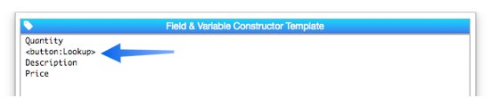
The button is generated on a separate line:
The tag can also specify the button width and any code associated with the button, like this:
<button:title:width:code>
<buttons:title:width:code,title:width:code,title:width:code>
The width is normally specified in points, but can also be specified in inches or centimeters. Here is an example with two buttons that have custom width and code.
When multiple buttons are defined on the same line in the template like this, they are generated on the same line in the form.
Code
The code:text> tag defines procedure code for text editor, data button and pop-up menus. If the tag is on the same row as one of these objects, that object will use the specified code.
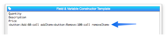
Quantity<code:call adjustQTY>
Description
Price<code:call adjustPRICE>
If the <code> tag is on a line with no object on it, that code will be used for all following objects. In this example, the subroutine logUpdate will be called when any of the fields are modified.
<code:call logUpdate>
Quantity
Description
Price"
You can change the code at different points, or use <code:> to completely eliminate the code for additional objects.
Tooltips (Help)
The <help> tag defines a tooltip for the current row.
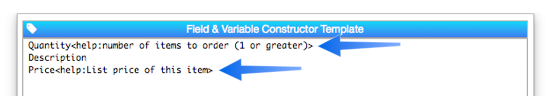
In data mode, the tooltip text will appear when the mouse hovers over this row.
Geometry
The tags in this section allow you to change how generated objects are laid out. All of the tags in this section include measurement values. These values are normally expressed in points (1 point = 1/72 inch) but you can also specify values in inches (1 in or 2.5 inch or 0.75") or centimeters (20 cm).
First up is <spacing:distance>. This specifies how far apart the objects are. The default is 2 points, but you can set it to larger or smaller values (even 0, though you probably don’t want to do that. This example spaces the objects 1/12th inch (6 points) apart.
You can see the extra spacing between the objects.
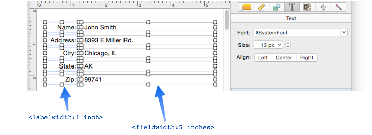
The <fieldwidth:distance> tag specifies how wide each text editor object should be. The default is 200 points (just under 3 inches). If the <variablewidth> tag is included, the field widths will vary, corresponding to the widths in the data sheet. The <labelwidth:distance> tag specifies how wide the labels on the left side are. The default is 120 points.
Here is the result:
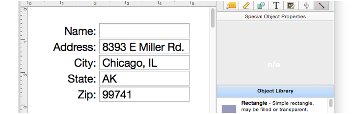
The new objects are normally generated starting from 1/2 inch below and to the right of the top left corner of the form, but you can change this to any location. This example starts generating the objects starting at 1 centimeter from the top, and 15 centimeters from the left edge of the form.
<top:1 cm><left:15 cm>
Name
Address
City
State
Zip
Note: Explicitly specifying the position disables the auto-placement feature that allows you to move generated objects, then regenerate them and have them stay in the new position. Because of this, you’ll usually not want to explicitly set the position with these tags.
Field/Variable Prefix
Sometimes the names of your fields or variables may have a prefix that you don’t want included in the labels. For example, suppose your field names are SubscriberName, SubscriberAddress, etc., and you just want the labels to be Name, Address, etc. You can use the <prefix> tag to generate this.
<prefix:Subscriber>"
Name
Address
City
State
Zip
Constructing Objects for a Dialog
If you are creating a dialog, use the <dialog> tag. This automatically generates Ok and Cancel buttons, and also adds the code necessary for proper dialog operation. If Ok/Cancel are not the buttons you need, you can include a comma separated list of buttons in the tag, like this,
<Dialog:New Subscriber,Cancel>
Name
Address
City
State
Zip
Buttons will be generated from right to left. You can have 1, 2, 3 or more buttons. You will probably need to adjust the width of the buttons after they are generated.
Removing Existing Form Objects
If the very first item in the template is the <zapform> tag, the form will be cleared before generating the new objects. Be careful with this tag – it will destroy everything in the form before adding the new objects!
Note: Even if you don’t include the <zapform> tag, this statement will clear any objects that were previously generated by this statement. In other words, even if you use this statement multiple times you’ll only end up with one set of generated objects.
Extra Tags
This statement will normally generate an error if it encounters tags that it doesn’t understand. However, if you put the <ignoreunknowntags> at the top of the template, unknown tags will be ignored. This can be handy if you want to create your own tags for other purposes.
Comments
You can include comments to yourself by starting a line with //. Note: Unlike Panorama procedures, you cannot start a comment in the middle of a line.
Comments are handy for temporarily disabling a line in the spec. Just put // at the beginning of the line and everything else in that line will be ignored.
See Also
- Automatic Mailing Label Construction -- creates a mailing label.
- Automatic Report Construction -- creates a tabular report with columns of data.
- Construct Menu -- used to automatically construct complex form applications, including calendars, lists, mailing labels, and more.
- Line Item Grid Constructor -- creates a grid of form elements for displaying and editing line item fields.
- Matrix Constructor -- quickly creating a Matrix Object from a template.
- Tab Panel Constructor -- quickly creating a Tab Panel Object from a template.
- Text Display Object -- is used to display text using a formula.
- Text Editor Object -- is used to edit text in a field or variable.
- Text List Constructor -- quickly creating a Text List Object from a template.
- Text Object Background Color/Gradient -- text object background colors and gradients.
History
| Version | Status | Notes |
| 10.2 | Updated | The template editor can now optionally be opened in a separate window that stays open until closed (instead of modal dialog). Many new layout options, including multiple fields or variables on a row, labels may be to the left or on top, full control over label color, style, alignment, borders and background (including gradients), ability to justify layout rows, and to snap items to a grid. Fields or variables can be displayed read only, you can specify the default insertion point, enable or disable the focus ring, enable pop-up editing, and increase the padding around edited text. |
| 10.0 | New | New in this version. |