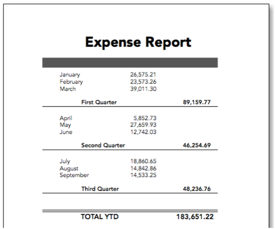
This topic discusses printing a database that has been organized into categories with summary records. (See Summary Records if you need a refresher on this topic.) The summary information (totals, averages, etc.) appears in temporary new summary records that temporarily become part of the database, like this.

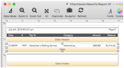
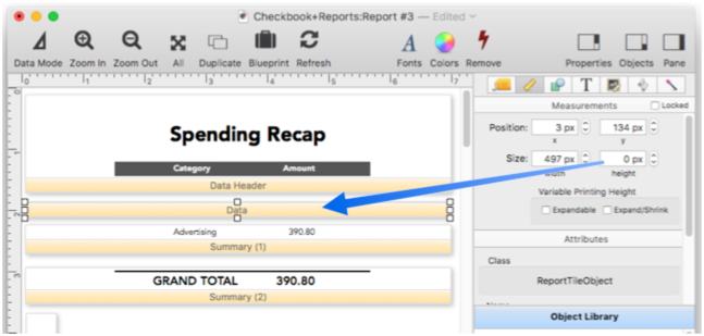
In an ordinary report, these summary records are printed just like any other record – in other words, they are printed with the data tile. Here’s an example of a typical form with a data tile.
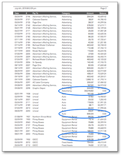
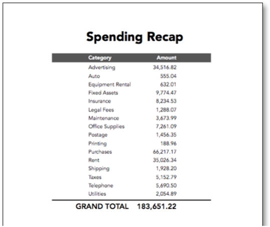
Here’s a page from the printout, with the summary records circled in blue. As you can see, the summary records are formatted exactly the same way as the regular data records.
If you want the summary records to print differently from regular data records you’ll need to add additional summary report tiles to your database (described in the next section). The use of these specialized tiles is strictly optional. If the report does not contain any summary tiles, Panorama will print summary records as if they were ordinary data records. For many reports this is just fine. If, however, you choose to use the specialized summary tiles, you can independently control how each summary level will be printed.
Summary Tiles
A summary tile works just like a data tile, except that the summary tile is used only when Panorama prints a summary record. Since a database may have up to 7 levels of summary records, a report may contain up to 7 summary tiles. For example, you could use summary tiles to print the data in 12 point Helvetica, subtotals (level 1) in 14 point and the grand total (level 2) in 18 point.
When Panorama is about to print a summary record, it checks to see if the report has a summary tile for that level. If it does, that summary tile will be placed in the report instead of the data tile. If there is no corresponding summary tile, Panorama will look for summary tiles corresponding to a lower summary level. If it finds such a tile, Panorama will use it to print the summary record. If Panorama doesn’t find a lower level summary tile, it gives up and uses the data tile to print the summary record.
The easiest way to create summary tiles is dragging to make a copy of the data tile by holding down the Option key while you drag the object. Once the new tile is created, use the properties panel to convert it from a data tile into the appropriate level summary tile.
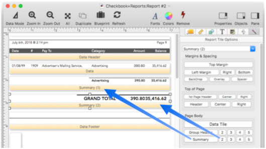
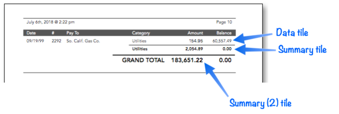
The illustration above is an example of a report with two summary tiles - one for subtotals and one for the grand total. Here is one page from the report that is printed by this form (assuming that the database has already been grouped by the Category field and totaled by the Amount field.
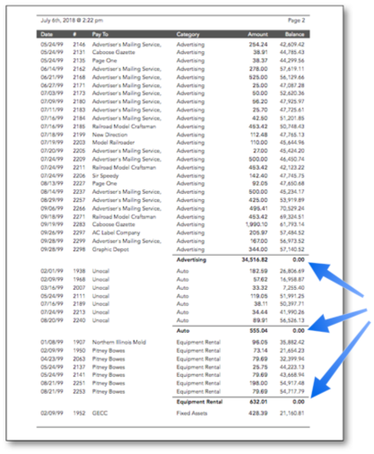
The last page of this report contains both level 1 (subtotal) and level 2 (in this case, grand total) summaries. Data records are printed with the Data tile, level 1 (subtotal) summary records are printed with the Summary (1) tile, and level 2 (grand total) summary records are printed with the Summary (2) tile.
Printing Summaries Without Data
Sometimes you may want to print only summary records without printing any data records. One method for doing this is to create a zero-height data tile, as shown in this example.
When this form is printed all of the data records are invisible because of the zero height Data tile and all you see are the summaries.
Remember that all reports must have a data tile, even if (as in this case) it is not actually visible in the printed report.
Printing Data Grouped by Month, Quarter, or Year
When a database has been grouped by month, quarter, or year, the dates should usually be formatted differently at each summary level. At the raw data level the entire date should be printed, while on the summary tiles only the month, quarter, or year should be printed. This is usually done with a Text Display object, using the datepattern( function with a pattern that prints only the part of the date you want. The pattern for a month summary could be Month yyyy, Mon-yy or mm-yy. For a quarter summary use qqqyy or Qtr “Qtr” yy. For a year use yy or yyyy. To lean more see Date Patterns.
Here’s an example that prints monthly summaries.

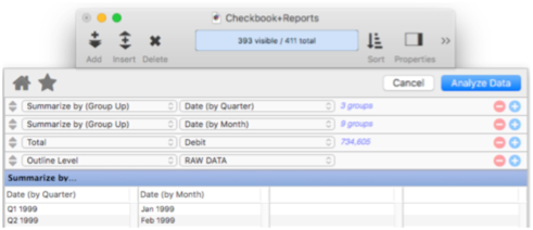
To prepare this report for printing you must Group Up by Quarter on the Date field, then Group Up by Month on the Date field, then Total the Debit field. One way to do this preparation is with the Summarize & Analyze Dialog.
Or, you could automate these steps with a procedure.
field Date
groupup by quarter
groupup by month
field Debit
total
Once the data is prepared you can print the report. It will look like this:
Group Headers
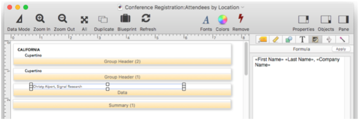
Panorama normally prints a header at the top of each report page. The Group Header tiles allow an individual header to be printed at the top of each group in the report. (Of course, the database must already be arranged into groups.) The Group Header tile can be used to print a title at the top of each group and also to provide extra spacing between groups. Here’s an example of a report with a group header. This example assumes that the database has been grouped by the PayTo field and totalled by the Debit field.
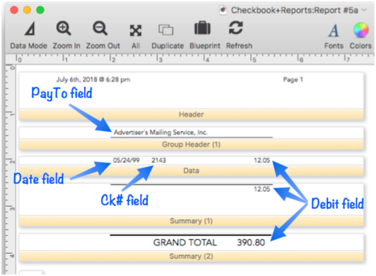
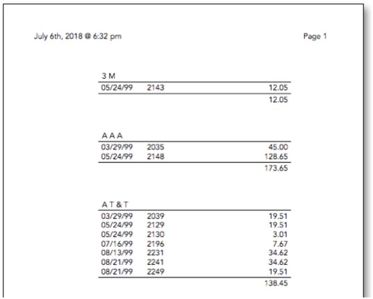
When it’s printed, this report looks like this.
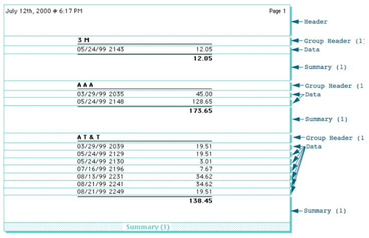
This illustration shows how Panorama assembles the tiles to create the final report. At the beginning of each group it prints the group header, then the data tiles. At the end of the group it prints the summary tile.
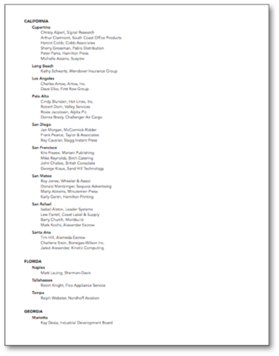
Sometimes two groups start at the same spot. For example, in a database grouped by State and City, the start of the California group may also be the start of the Alameda group. In this case the higher level wins, and Panorama will print the group header for California. Because of this, the higher level summary headers should include any graphics or data needed for each lower level, as shown in this illustration.
Here’s the finished report.
Here’s how Panorama assembles the tiles to create this report.
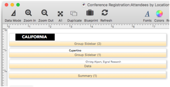
Group Sidebars
The Group Sidebar tile allows you to print a “header” beside each group (either to the left or to the right) instead of above the group. The group sidebar tile is unusual because when it is printed, it will actually overlap the data tiles that follow. It is up to you to design the graphics on the group sidebar and data tiles so that they don’t interfere with each other. In other words, all the text and graphics on the group sidebar tile should be to the left with the text and graphics on the data tile to the right, or vice versa.
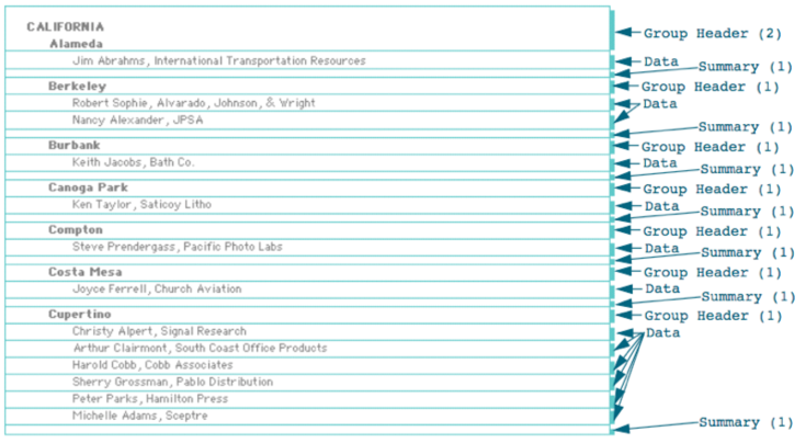
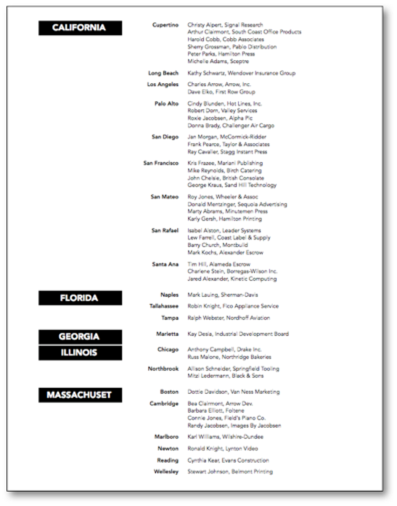
Here is a report with two Group Sidebar tiles. The report is designed to be printed after the database has been grouped by State and then by City.
Here is the printed report. Notice that at the beginning of each state and city, the sidebar prints next to the data. The sidebar is actually overlaying the data (and in the case of the state, the other sidebar) but because of the way the graphics are laid out the sidebars don’t interfere with each other or with the data.
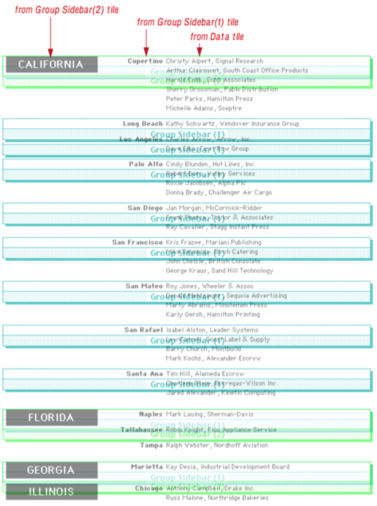
Here’s how Panorama assembles the tiles to create this report. Because of the overlapping tiles this can be a bit confusing, so the Data tiles have been omitted from this illustration. The Group Sidebar(2) tiles are shown in green, and the Group Sidebar(1) tiles are shown in blue.
Tip: Although the group sidebar will overlap the data tiles when the report is printed, they must not overlap on the form window.
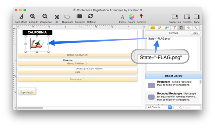
You can add images to a group sidebar using an Image Display object. This report is exactly the same as the previous example except for the addition of the image displaying the state flag.
Here is the printed report.
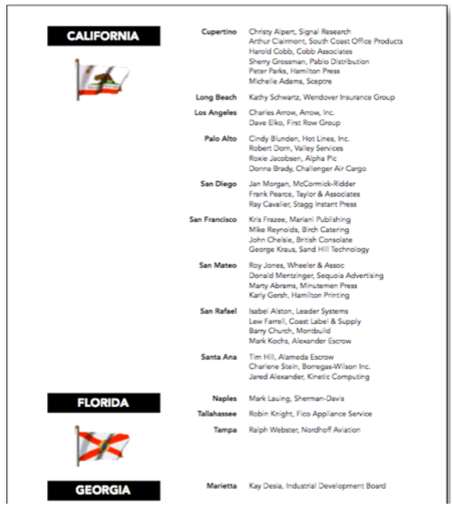
Notice that for the state of Florida the sidebar is actually taller than the data records. In that case Panorama will leave a gap between the last data record in a group and the first data record of the next group.
See Also
- Automatic Mailing Label Construction -- creates a mailing label.
- Automatic Report Construction -- creates a tabular report with columns of data.
- Custom Report Headers and Footers -- setting up custom report headers and footers.
- Custom Report Margins -- specifying the top, left, right and bottom margins of a custom report.
- Deleting All Summary Records -- when finished with summary records, they must be deleted.
- Deleting Raw Data Records -- converting summaries into data.
- Expanding and Collapsing the Summary Outline -- to see more or less detail.
- Generating Summaries Manually -- manually generating summary records in 3 steps (Group, Calculate, Outline).
- groupseq( -- returns the sequence number within a summary level.
- Printing Multiple Column Reports -- printing reports with two, three or more columns (for example mailing labels).
- Printing Multiple Page Records -- Panorama can print up to 9 pages for each record in a custom report (for example multi page invoices, etc.)
- Ranking Summaries -- ranking summary values
- Report Tile Object -- component for assembling a custom report.
- Reports -- Panorama has a very flexible system for printing custom reports, labels and forms.
- Running Difference -- calculating a running difference down an entire database column.
- Running Total -- calculating a running total down an entire database column.
- setreportcolumns -- allows a procedure to control the number of columns of a report, and the direction (across or down).
- Summarize & Analyze Dialog -- is a one stop dialog for creating and filling in summary records based on pre-selected criteria.
- Summarize & Analyze Favorites -- saving and recalling favorite summaries.
- Summary Records -- are temporary records used for calculating totals, subtotals, and other summary information.
- Tiles In Action -- basic rules for using tiles to print custom reports.
- Variable Height Records -- custom reports with different heights for each record.
- View-As-List Forms -- displaying a custom data layout as a continuous sheet.
History
| Version | Status | Notes |
| 10.0 | Updated | Carried over from Panorama 6.0, with some updates. |