Push Buttons have one mission in life – to trigger a program. You push the button and the program starts, simple as that. This example shows how to create and try out a push button in 15 seconds.
In many ways the most important component of a push button is the code it triggers. In fact this is so important that it is a separate topic – see Form Object Code to learn all the details.
Button Options
The magic panel for push button objects contains about a half-dozen options.
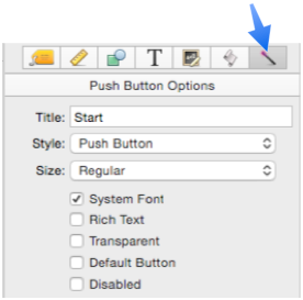
Each of these options is discussed in detail below.
Title – The first option is the title that appears on the push button.
If necessary, the code in the button can use the objectinfo( function to find out what the title of the button is:
objectinfo("title",objectinfo("clickedobjectid"))
The info(“trigger”) also returns the name of the button, prefixed with Button. (for example Button.Start).
Style – This option specifies the style of the button. Use the pop-up menu to pick the style you want. (The first option, Push Button, is the default style.)
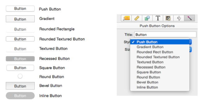
Only styles supported by OS X are included (see Cocoa Objects to learn more).
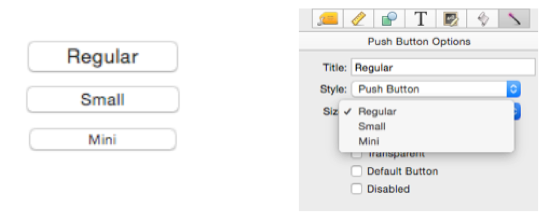
Size – Most push button styles are available in three sizes: Regular, Small and Mini. (See Cocoa Objects to learn the reason for this limitation.)
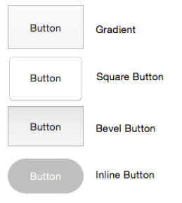
There are 4 push button styles that can have variable height, as shown here. For these styles, the Size popup controls the size of the button title, but not the height of the button.
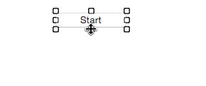
This animation shows the difference between button styles that are only available in three heights and styles that allow any height.
System Font – If this option is checked the button title will always be displayed using the standard system font and font size. If you want to use a non-standard font or size, first uncheck this option, then choose the font and size from the Text panel (see Fonts).
Rich Text – If this option is checked the button title can include rich text tags for different styles, fonts, colors – even icons.
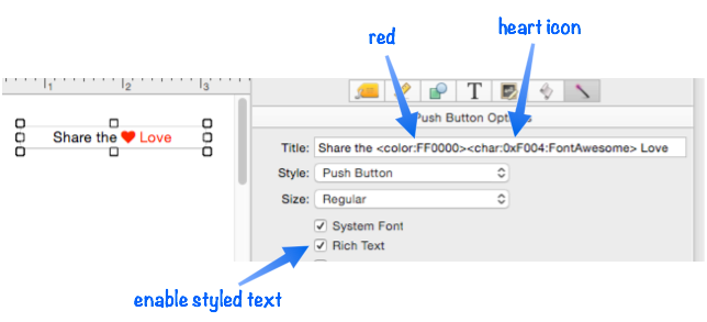
See Rich Text for the details on available style options, and Font Awesome Icons for more information about using icons.
Transparent – If this option is checked, the button will be completely transparent (the title will also be hidden). This is handy if you want to put the button on top of other graphics. (Note: Making the button transparent also changes the way the button responds to clicks. Instead of triggering the procedure when you release the mouse, a transparent button will trigger the procedure immediately when you click on the mouse.)
In previous versions of Panorama it was very common to put a transparent button on top of an image to create a custom button. This looked nice, but made editing the form more complicated because the two objects were stacked on top of each other. In Panorama X this technique is no longer necessary because you can put the code right into the Image Display object – in other words the Image Display button becomes an push button itself.
In fact, in Panorama X any type of object can be a push button – an image, a rectangle, a star, even text. So it’s usually no longer necessary to go thru the extra complication of adding a transparent push button on top of other objects.
Default Button – If this option is checked the button becomes the default button. The default button is blue (and if anyone is still running OS X 10.9 Mavericks, you’ll see that the button throbs).
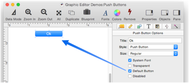
When a form is used as a dialog (not in a regular window), pressing the Return or Enter key when no text editor is active will automatically trigger the procedure associated with the default button (if any). Because of this, you should never set the Default option for more than one button on a dialog. If you do, it is not predictable which button will be triggered when the Return or Enter key is pressed. In a normal window (not a dialog), setting a button as default highlights the button but does not affect Panorama’s response to Return or Enter keys.
Disabled – This option disables the button. When the button is disabled it is dimmed and it can’t be clicked on.
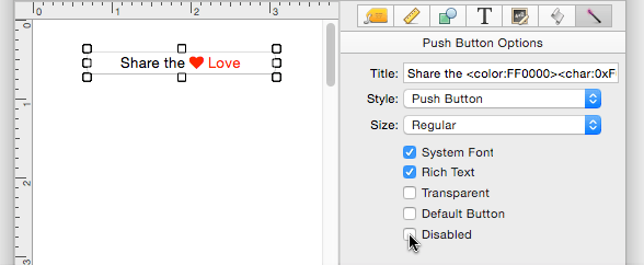
Of course there is no point in a button that is permanently disabled. So normally you would enable/disable a button with a procedure.
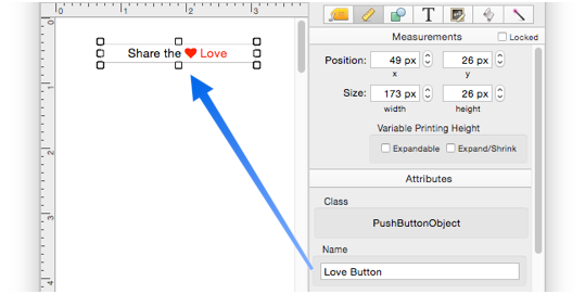
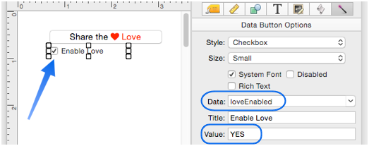
To access a button (or any object) with a procedure, it must have a name. We’ll call this button Love Button.
For this example we’ll create a checkbox that will be programmed to enable and disable the push button. See Data Button Object to learn more about checkboxes. This checkbox is has been set up with a variable named loveEnabled, which will toggle between YES and empty.
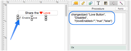
Here is the code that is triggered when the checkbox is clicked. This code will enable and disable the Love Button push button. See Modifiable Object Properties to learn about object properties that can be changed by the ChangeObject statement.
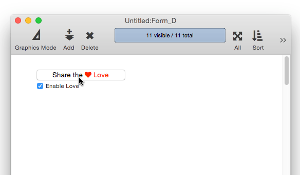
That’s it! Clicking on the checkbox now enables and disables the main push button.
See Also
- Adjusting Object Spacing -- adjust the spacing between multiple selected objects so that the same amount of space is in between each pair of objects.
- adjustobjectspacing -- adjusts the spacing of selected objects in a form.
- adjustobjectspacingdialog -- opens a dialog sheet to adjust the spacing of the currently selected objects.
- Aligning Objects -- so that two or more object edges are made even with each other.
- Automatic Form Construction -- creates a column of form elements for editing data fields (or variables).
- Automatic Mailing Label Construction -- creates a mailing label.
- Automatic Report Construction -- creates a tabular report with columns of data.
- Cocoa Objects -- discussion of how objects are implemented in Panorama X compared to earlier versions
- Creating a New Form Object -- with the Object Library.
- Data Button Object -- is used to create checkboxes and radio buttons.
- Diagnosing a Formula embedded in a Form Object -- diagnosing problems with formulas embedded in form objects.
- Displaying Data in a Grid -- fundamentals of displaying data in a grid (Text List/Matrix).
- Duplicating Objects -- to make copies of one or more objects.
- Fixed Image Object -- is used for fixed images (images that never change).
- Fonts -- setting the font and text size of form text objects.
- Form Object Appearance -- changing the color, fill, stroke, opacity and drop shadow attributes of selected objects.
- Form Object Blueprint -- display and edit raw object specifications
- Form Object Code -- associating programming code with an object
- Grouping Objects -- allows you to manipulate multiple objects as if they were a single object.
- Image Display Animations -- animated images.
- Image Display Colors and Gradients -- displaying pure colors and gradients
- Image Display Data Buttons -- checkboxes and radio buttons created from custom images.
- Image Display Object -- is used for dynamic images (images that change depending on the data).
- Image Display Push Buttons -- push buttons created from custom images.
- info("clickedobjectname") -- returns the name of the button that was just clicked.
- Line Item Grid Constructor -- creates a grid of form elements for displaying and editing line item fields.
- Line Object -- draws a line within a form.
- Matrix Clicking -- handling clicks in a Matrix Object.
- Matrix Constructor -- quickly creating a Matrix Object from a template.
- Matrix Database Integration -- synchronizing a Matrix Object with a database.
- Matrix Geometry -- customizing the size and geometry of Matrix Object elements.
- Matrix Header and Horizontal Scrolling -- setting up a custom header for a Matrix Object grid.
- Matrix Object -- displaying a grid of items with a custom arrangement.
- Matrix Object Frame -- setting up the arrangement of items within a Matrix Object.
- Matrix Programming -- programming a Matrix object.
- Object Inspector Panel -- is used to view and modify the attributes of selected objects in a form.
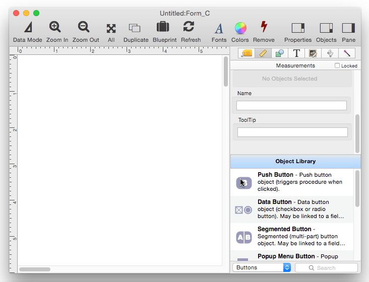
- Object Library -- is used to create new objects in a form.
- Object Names -- can be used to identify an object in a program.
- Oval Object -- draws an oval or circle within a form.
- Polygon Object -- draws a polygon within a form.
- Popup Menu Button Object -- is used to create popup menus anywhere on a form.
- Progress Indicator Object -- is used to create progress indicators
- Rectangle Object -- draws a rectangle or square within a form.
- Report Tile Object -- component for assembling a custom report.
- Rounded Rectangle Object -- draws a rectangle with round corners within a form.
- Scroll Bar Object -- is used to create scroll bars.
- Segmented Button Object -- is used to created segmented buttons.
- Selecting Form Objects -- so that they can be modified.
- Slider Object -- is used to create sliders and knobs.
- Smart Resize -- adjusts the sizes and locations of the other selected objects to match the change of one object.
- Star Object -- draws a star within a form.
- Stepper Object -- is used to create numeric steppers for use with Text Editor objects.
- Tab Panel Appearance -- appearance options for a Tab Panel Object.
- Tab Panel Buttons and Selection -- button options for a Tab Panel Object.
- Tab Panel Constructor -- quickly creating a Tab Panel Object from a template.
- Tab Panel Content -- setting up the content for a Tab Panel Object.
- Tab Panel Forms -- setting up the forms for a Tab Panel Object.
- Tab Panel Object -- switchable tab panels.
- Text Display Object -- is used to display text using a formula.
- Text Editor Object -- is used to edit text in a field or variable.
- Text Label Object -- displays a short, fixed, text item within a form.
- Text List Appearance -- customizing the appearance of a Text List Object.
- Text List Constructor -- quickly creating a Text List Object from a template.
- Text List Database Integration -- synchronizing a Text List Object with a database.
- Text List Multiple Columns -- displaying multiple columns in a Text List Object
- Text List Object -- displaying a grid of text.
- Text List Programming -- programming a Text List Object.
- Text List Searching -- searching within a Text List Object.
- Text List Selection -- selecting items in a Text List Object.
- Text Object Background Color/Gradient -- text object background colors and gradients.
- Web Browser Object -- is used to display web pages from within a Panorama form.
History
| Version | Status | Notes |
| 10.0 | Updated | Carried over from Panorama 6.0 from Push Button SuperObjects, but with some new features, including rich text and the ability to be disabled. This version of Panorama only supports standard system button styles, so some button styles that were available in previous versions of Panorama are no longer available. |